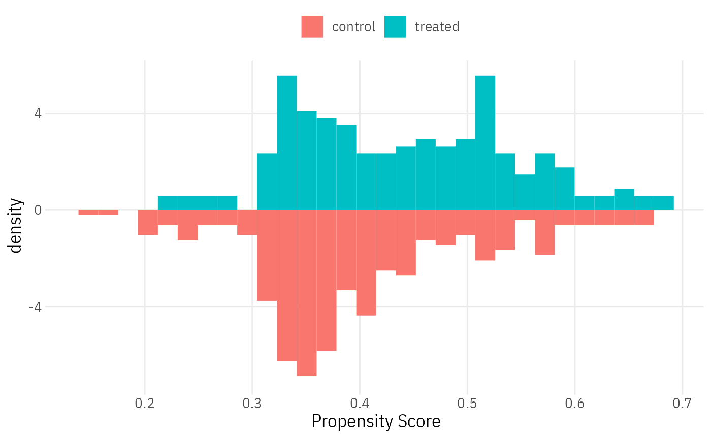
Histogram of pscore distributions in treatment and control groups
overlap_histogram.RdHistogram of pscore distributions in treatment and control groups
Examples
data(lalonde.exp)
pscore = glm(treat ~ . - re78, lalonde.exp, family = binomial)$fitted.values
overlap_histogram(lalonde.exp$treat, pscore) + lal_plot_theme()
#> Warning: The dot-dot notation (`..density..`) was deprecated in ggplot2 3.4.0.
#> ℹ Please use `after_stat(density)` instead.
#> ℹ The deprecated feature was likely used in the LalRUtils package.
#>   Please report the issue to the authors.
#> `stat_bin()` using `bins = 30`. Pick better value with `binwidth`.
#> `stat_bin()` using `bins = 30`. Pick better value with `binwidth`.