Visualisation Notes in R
notes from Healy's Socviz book
In [1]:
rm(list=ls())
library(LalRUtils)
my_packages <- c("tidyverse", "broom", "coefplot", "cowplot","magrittr","skimr","data.table",
                 "gapminder", "GGally", "ggrepel", "ggridges", "gridExtra","ggthemes",
                 "here", "interplot", "margins", "maps", "mapproj",
                 "mapdata", "MASS", "quantreg", "rlang", "scales",
                 "survey", "srvyr", "viridis", "viridisLite", "devtools")
load_or_install(my_packages)
options(repr.plot.width = 10, repr.plot.height=8)
theme_set(lal_plot_theme())
In [2]:
library(socviz)
In [3]:
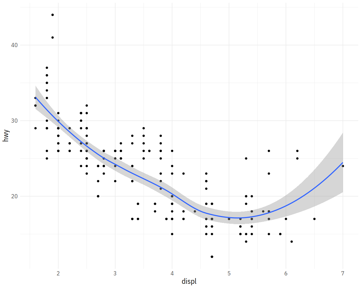
ggplot(mpg, aes(displ, hwy)) + geom_point() + geom_smooth()
In [4]:
url <- "https://cdn.rawgit.com/kjhealy/viz-organdata/master/organdonation.csv"
organs <- fread(url)
In [5]:
organs %>% skim_tee()
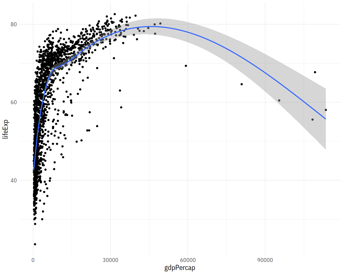
In [6]:
p <- ggplot(data = gapminder,
            mapping = aes(x = gdpPercap, y = lifeExp))
p + geom_point() + geom_smooth()

In [7]:
p <- ggplot(data = gapminder,
            mapping = aes(x = gdpPercap,
                          y=lifeExp))
p + geom_point() +
    geom_smooth(method = "gam")
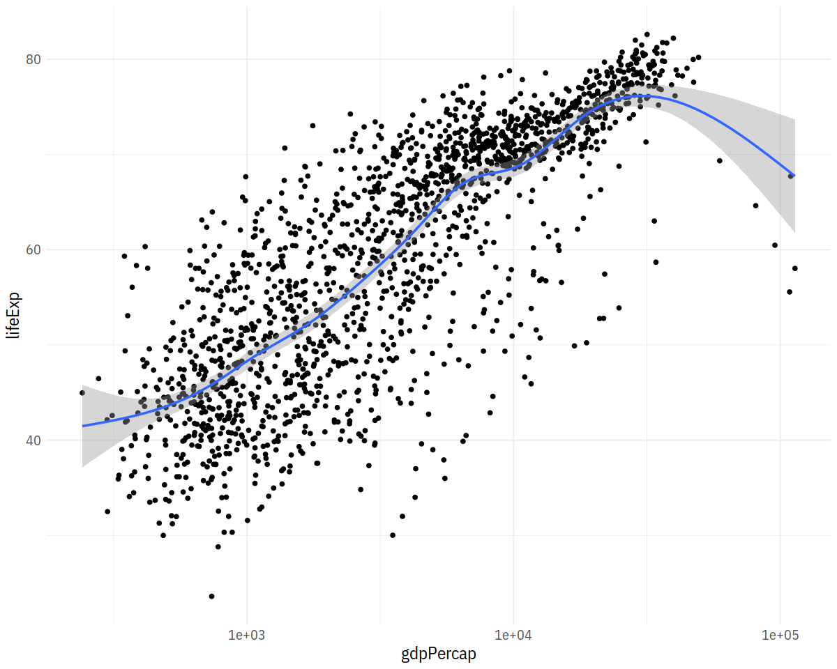
In [8]:
p + geom_point() +
    geom_smooth(method = "gam")  + scale_x_log10()
In [9]:
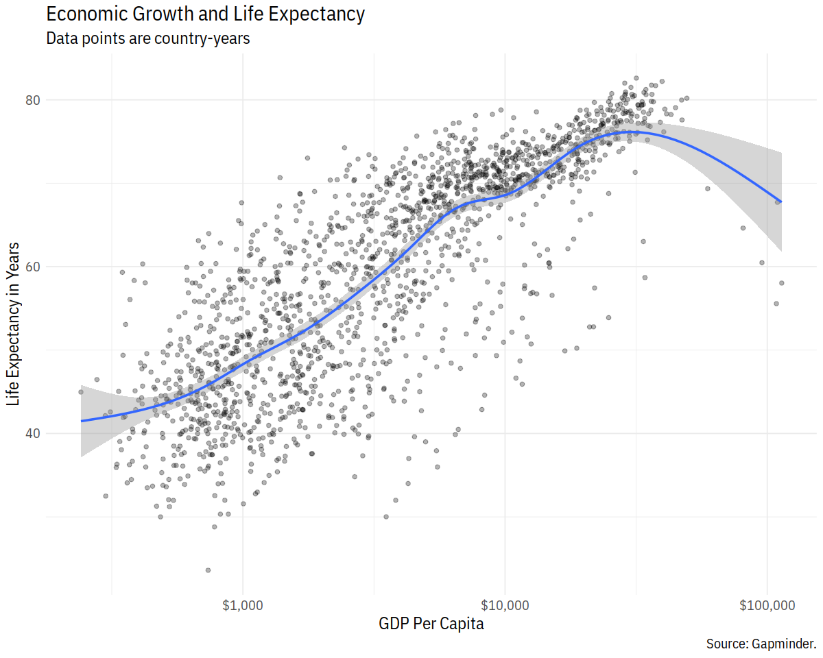
p <- ggplot(data = gapminder, mapping = aes(x = gdpPercap, y=lifeExp))
p + geom_point(alpha = 0.3) +
    geom_smooth(method = "gam") +
    scale_x_log10(labels = scales::dollar) +
    labs(x = "GDP Per Capita", y = "Life Expectancy in Years",
         title = "Economic Growth and Life Expectancy",
         subtitle = "Data points are country-years",
         caption = "Source: Gapminder.")
In [10]:
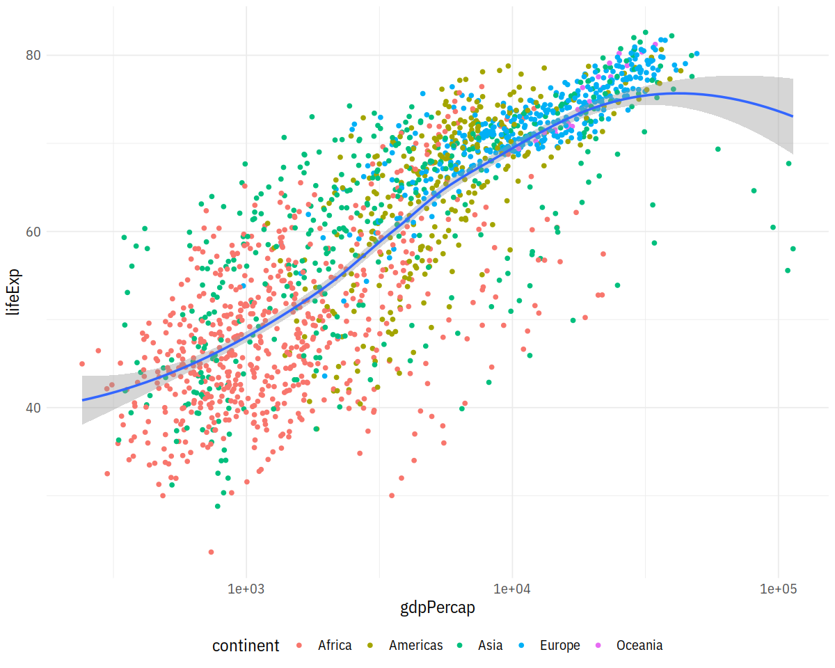
p <- ggplot(data = gapminder,
            mapping = aes(x = gdpPercap,
                          y = lifeExp))
p + geom_point(aes(color = continent)) +
    geom_smooth(method = "loess") +
    scale_x_log10() + theme(legend.position='bottom')
In [11]:
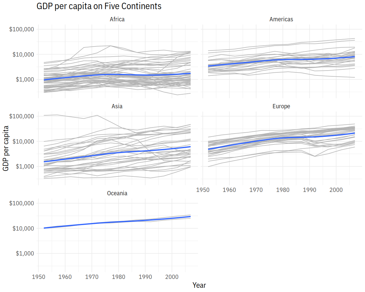
p <- ggplot(data = gapminder, mapping = aes(x = year, y = gdpPercap))
p + geom_line(color="gray70", aes(group = country)) +
    geom_smooth(size = 1.1, method = "loess", se = FALSE) +
    scale_y_log10(labels=scales::dollar) +
    facet_wrap(~ continent, ncol = 2) +
    labs(x = "Year",
         y = "GDP per capita",
         title = "GDP per capita on Five Continents")
In [14]:
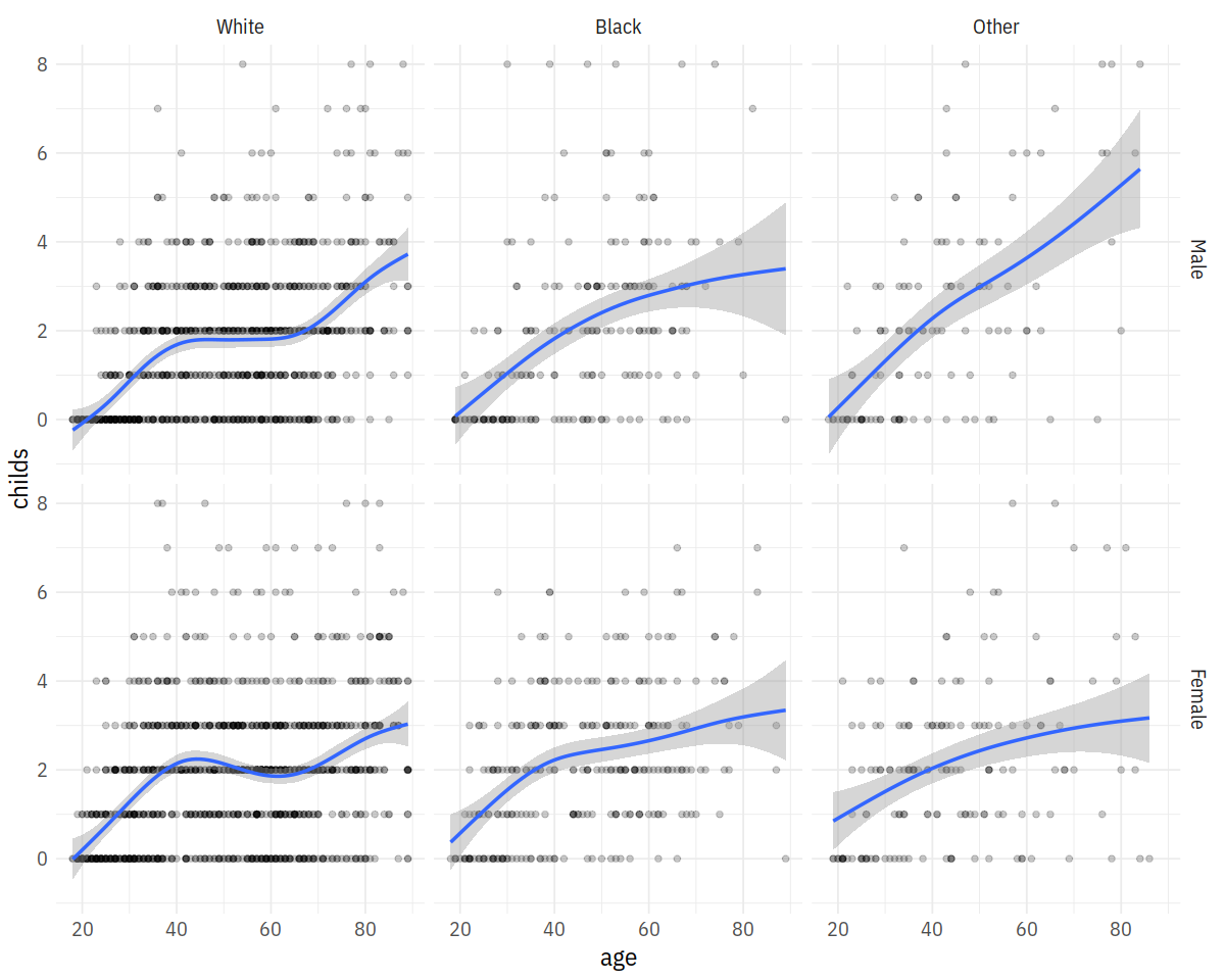
p <- ggplot(data = gss_sm,
            mapping = aes(x = age, y = childs))
p + geom_point(alpha = 0.2) +
    geom_smooth() +
    facet_grid(sex ~ race)
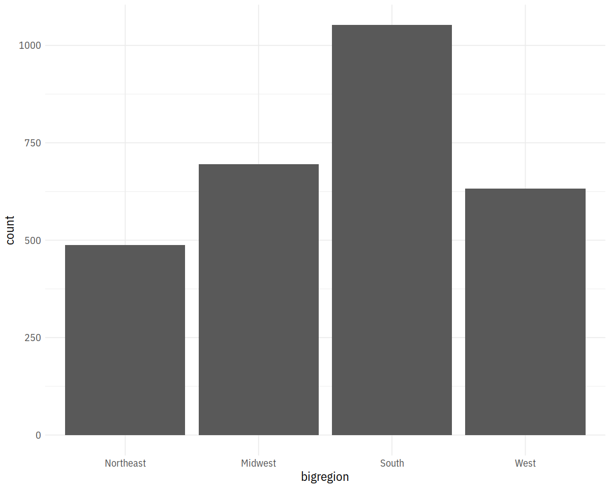
In [13]:
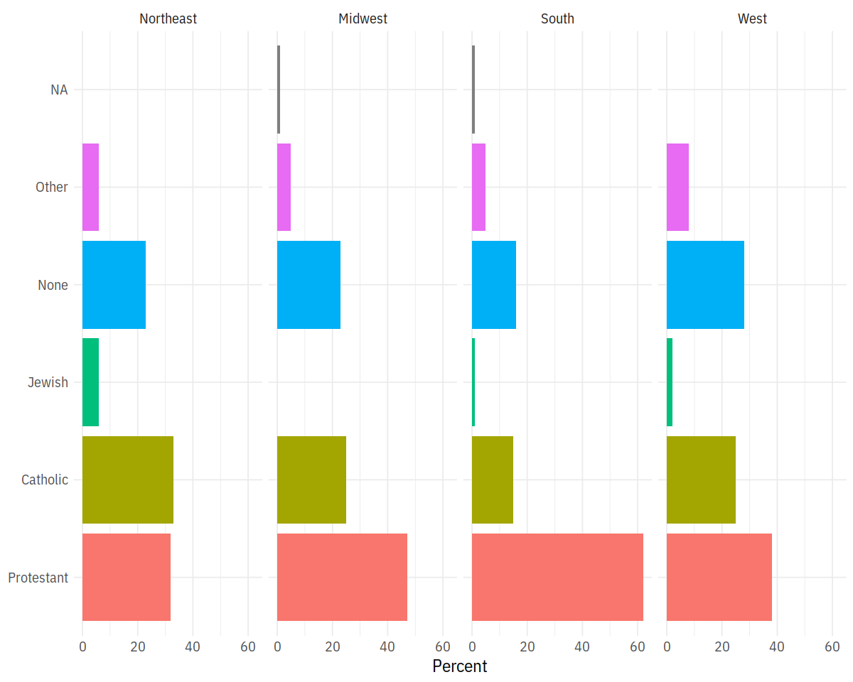
p <- ggplot(data = gss_sm,
            mapping = aes(x = bigregion))
p + geom_bar()
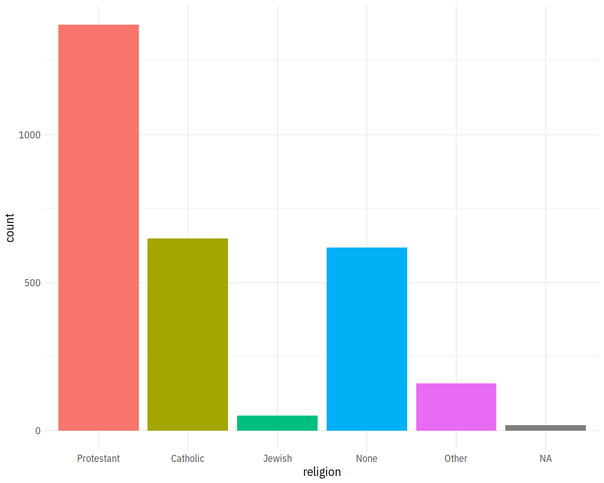
In [15]:
p <- ggplot(data = gss_sm,
            mapping = aes(x = religion, fill = religion))
p + geom_bar() + guides(fill = F)
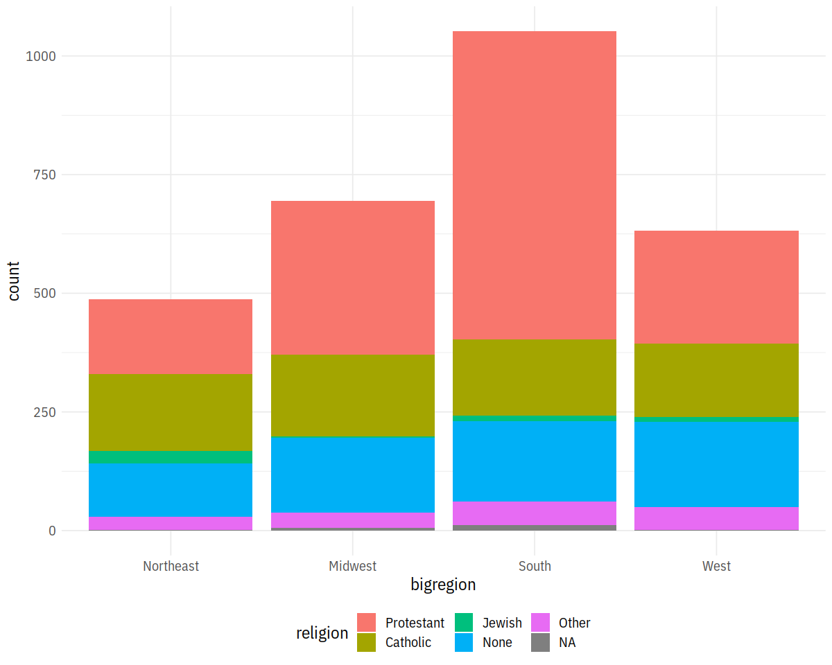
In [16]:
p <- ggplot(data = gss_sm,
mapping = aes(x = bigregion, fill = religion))
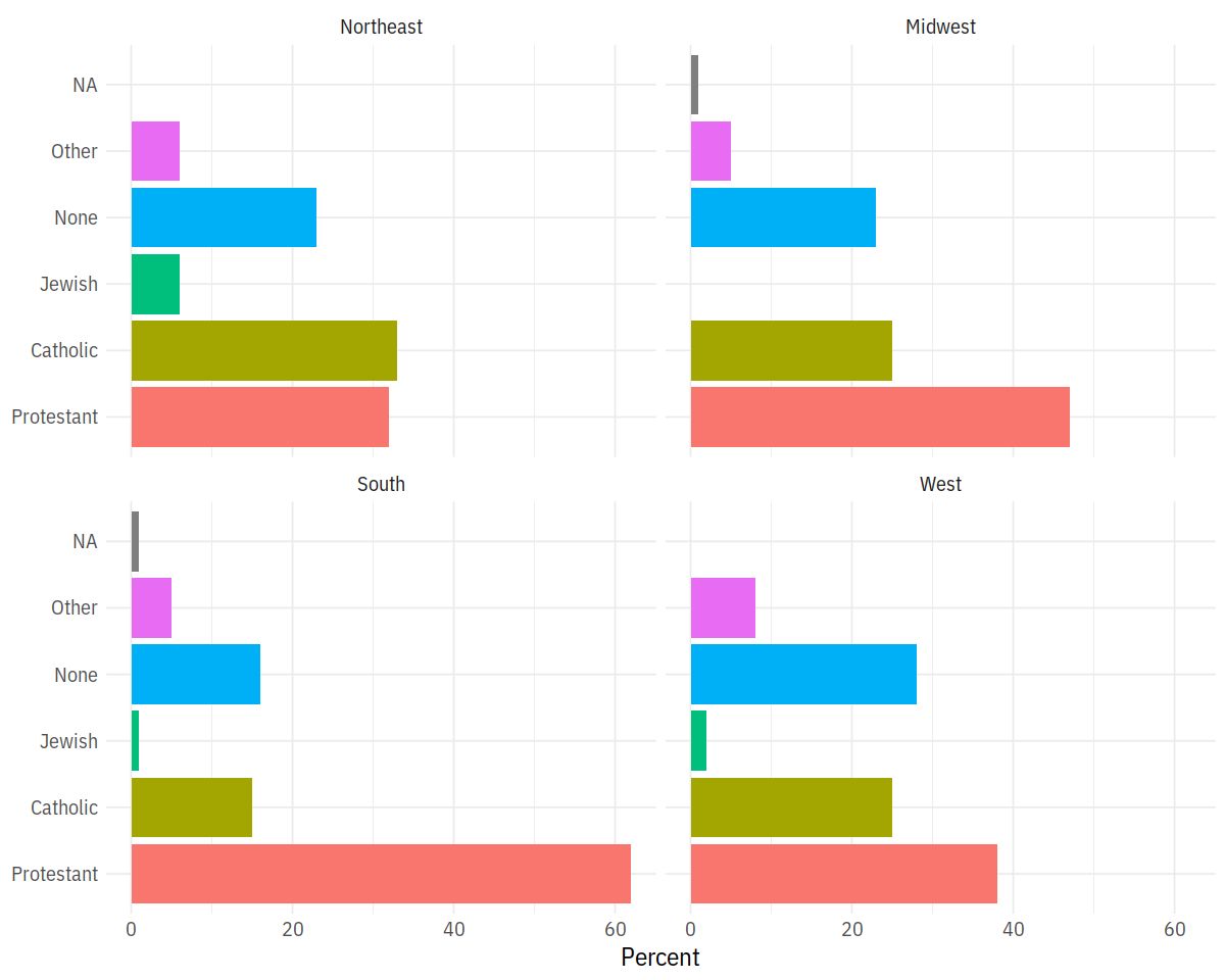
p + geom_bar()
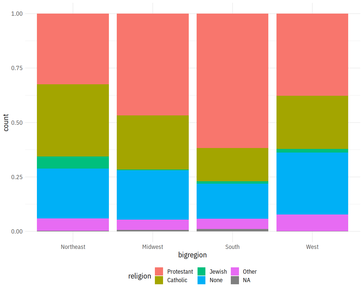
In [17]:
p <- ggplot(data = gss_sm,
            mapping = aes(x = bigregion, fill = religion))
p + geom_bar(position='fill')
Density Plots
In [18]:
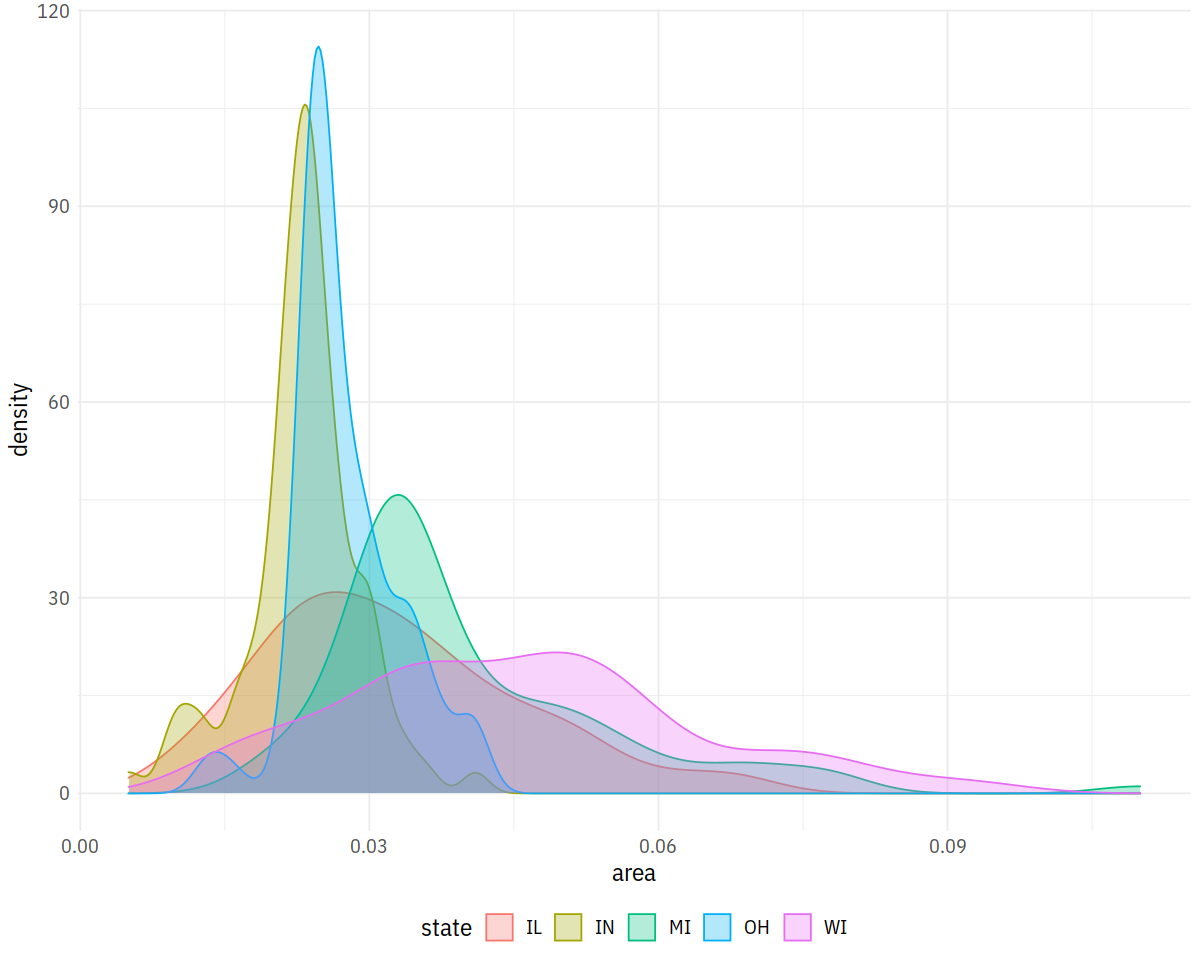
p <- ggplot(data = midwest,
            mapping = aes(x = area, fill = state, color = state))
p + geom_density(alpha = 0.3)
In [19]:
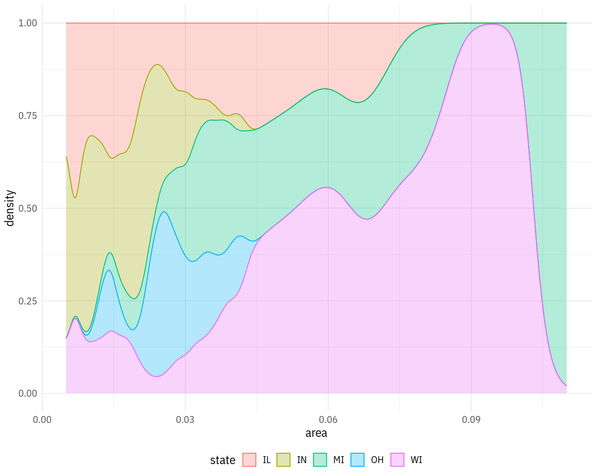
p <- ggplot(data = midwest,
            mapping = aes(x = area, fill = state, color = state))
p + geom_density(alpha = 0.3, position='fill')
In [20]:
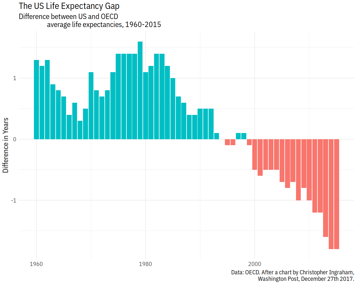
p <- ggplot(data = oecd_sum,
            mapping = aes(x = year, y = diff, fill = hi_lo))
p + geom_col() + guides(fill = FALSE) +
  labs(x = NULL, y = "Difference in Years",
       title = "The US Life Expectancy Gap",
       subtitle = "Difference between US and OECD
                   average life expectancies, 1960-2015",
       caption = "Data: OECD. After a chart by Christopher Ingraham,
                  Washington Post, December 27th 2017.")
Grouped Bar Plots
In [21]:
rel_by_region <- gss_sm %>%
    group_by(bigregion, religion) %>%
    summarize(N = n()) %>%
    mutate(freq = N / sum(N),
           pct = round((freq*100), 0))
rel_by_region %>% head
In [22]:
p <- ggplot(rel_by_region, aes(x = religion, y = pct, fill = religion))
p + geom_col(position = "dodge2") +
    labs(x = NULL, y = "Percent", fill = "Religion") +
    guides(fill = FALSE) +
    coord_flip() +
    facet_grid(~ bigregion) + lal_plot_theme()
In [23]:
p <- ggplot(rel_by_region, aes(x = religion, y = pct, fill = religion))
p + geom_col(position = "dodge2") +
    labs(x = NULL, y = "Percent", fill = "Religion") +
    guides(fill = FALSE) +
    coord_flip() +
    facet_wrap(~ bigregion)
Box and Whiskers
In [24]:
p <- ggplot(data = organdata,
mapping = aes(x = reorder(country, donors, na.rm=TRUE),
y = donors, fill = world))
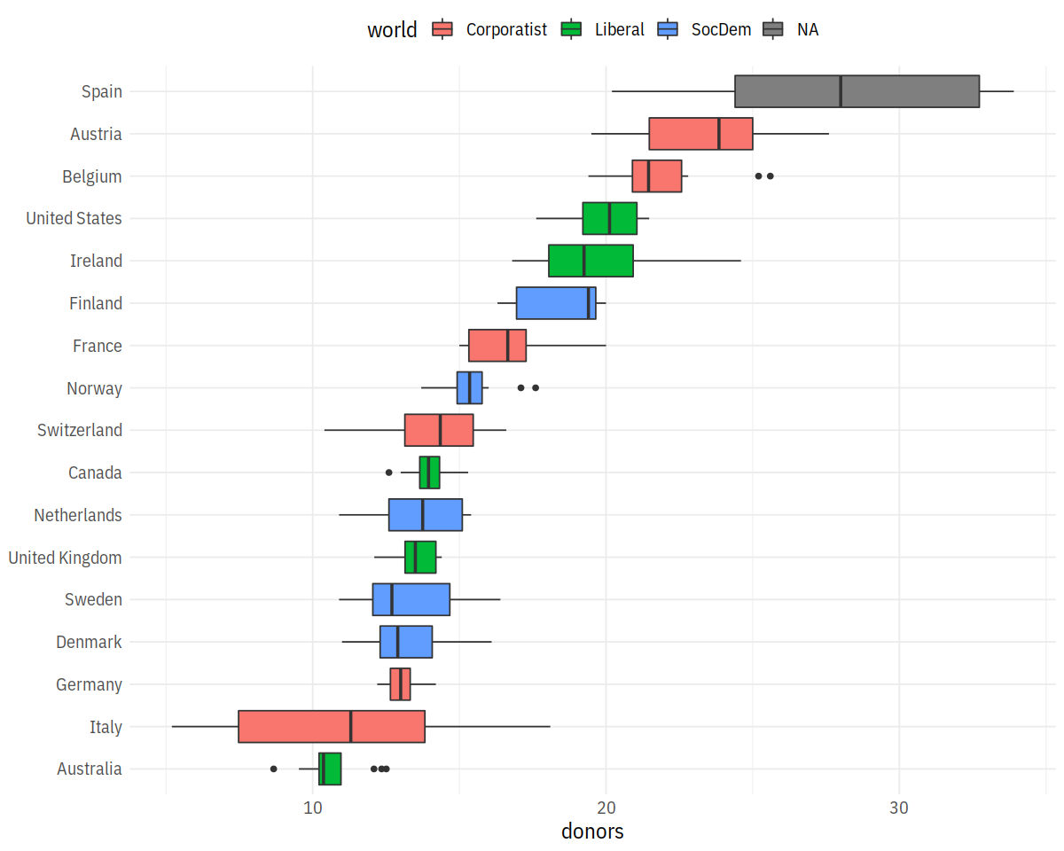
p + geom_boxplot() + labs(x=NULL) +
coord_flip() + theme(legend.position = "top")
Jitter Plot
In [25]:
p <- ggplot(data = organdata,
mapping = aes(x = reorder(country, donors, na.rm=TRUE),
y = donors, color = world))
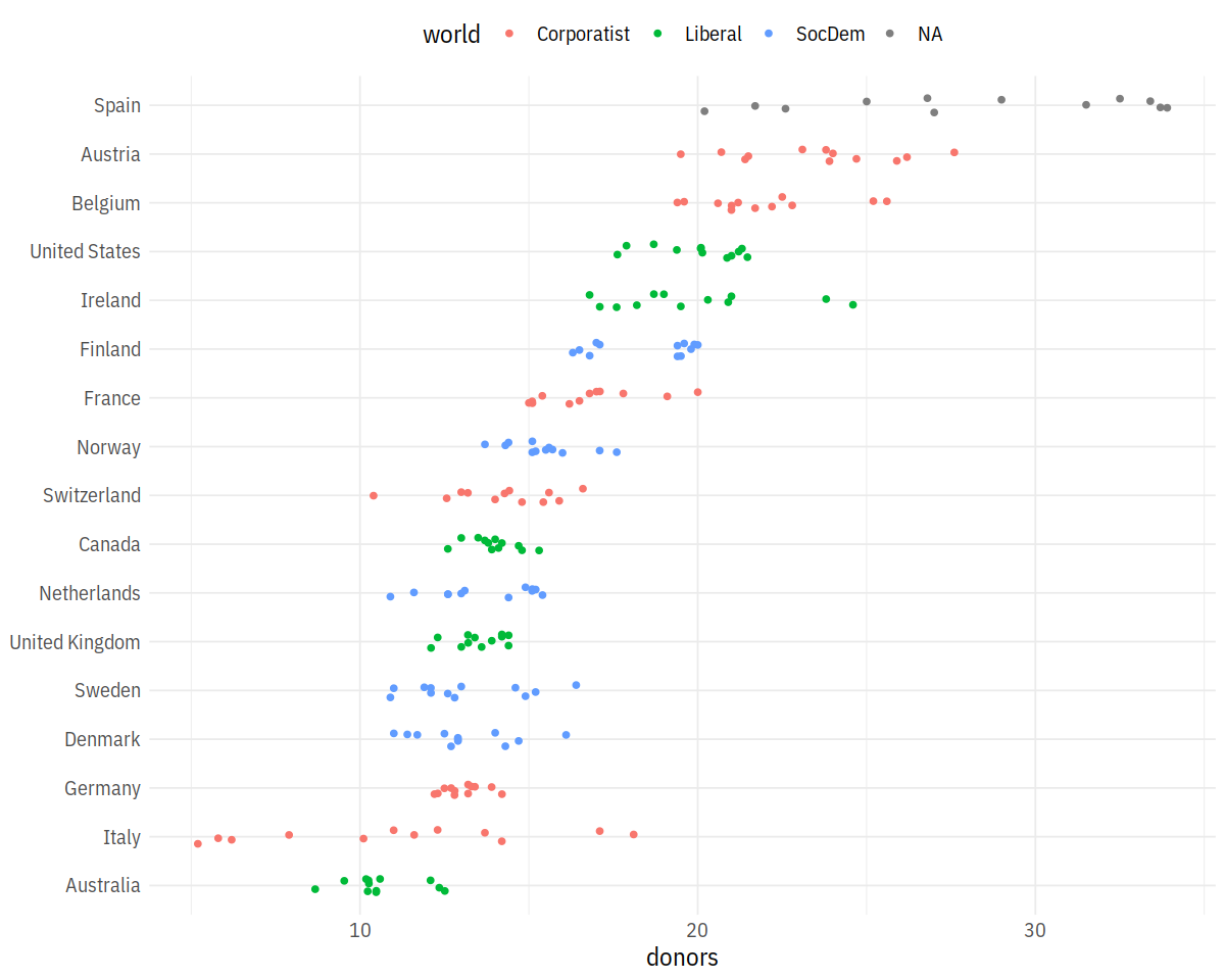
p + geom_jitter(position = position_jitter(width=0.15)) + # geom_boxplot(alpha=0.1) +
labs(x=NULL) + coord_flip() + theme(legend.position='top')
Cleveland Dotplots
In [27]:
supermarket = readxl::read_excel('Supermarket Transactions.xlsx', sheet='Data')
In [28]:
by_country <- organdata %>% group_by(consent_law, country) %>%
summarize_if(is.numeric, funs(mean, sd), na.rm = TRUE) %>%
ungroup()
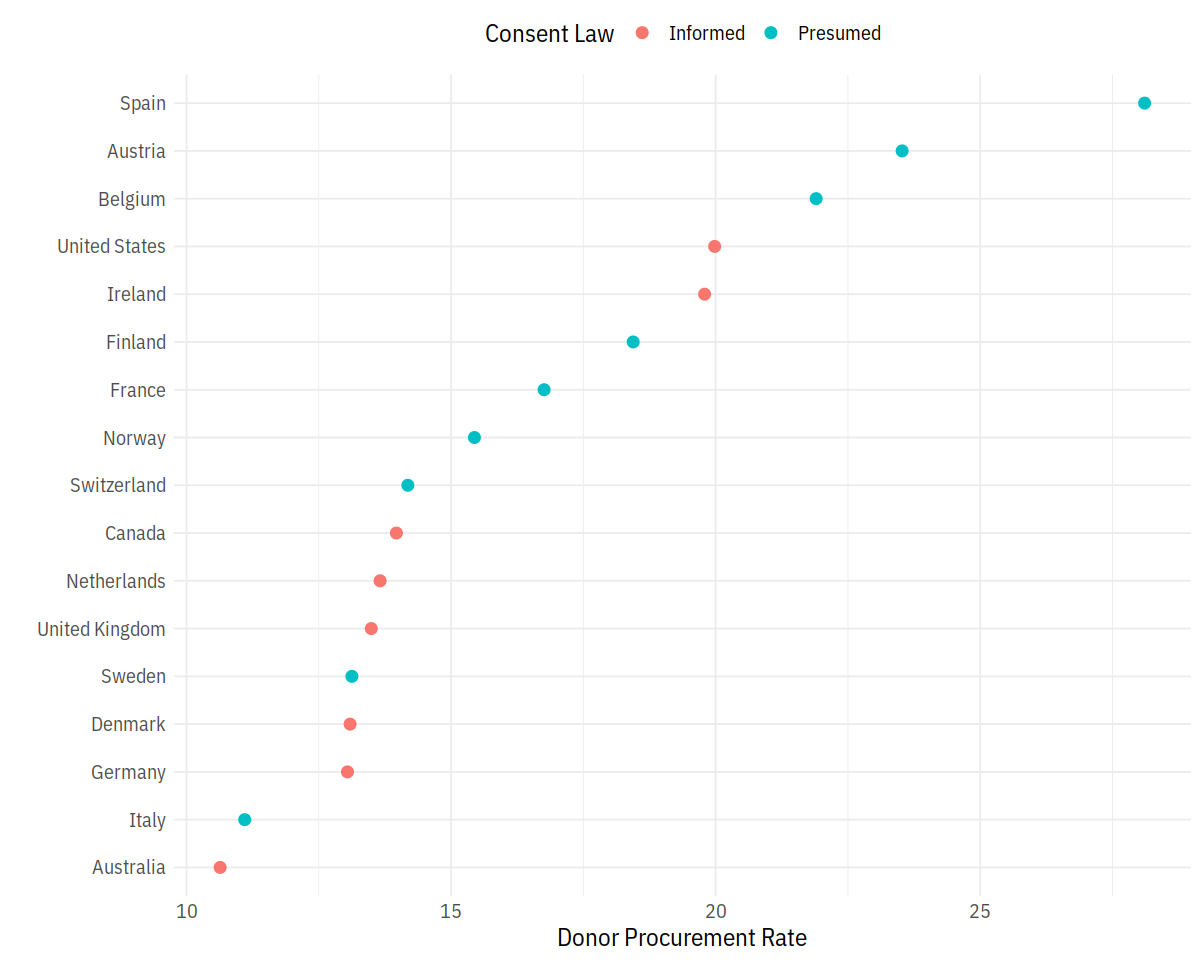
p <- ggplot(data = by_country,
mapping = aes(x = donors_mean, y = reorder(country, donors_mean),
color = consent_law))
p + geom_point(size=3) +
labs(x = "Donor Procurement Rate",
y = "", color = "Consent Law") +
theme(legend.position="top")
In [29]:
city_rev <- supermarket %>%
        group_by(City) %>%
        summarise(Revenue = sum(Revenue, na.rm = TRUE)) %>%
        arrange(Revenue) %>%
        mutate(City = factor(City, levels = .$City))

city_gender_rev <- supermarket %>%
        group_by(City, Gender) %>%
        summarise(Revenue = sum(Revenue, na.rm = TRUE)) %>%
        ungroup() %>%
        mutate(City = factor(City, levels = city_rev$City))
Bar Plots
In [30]:
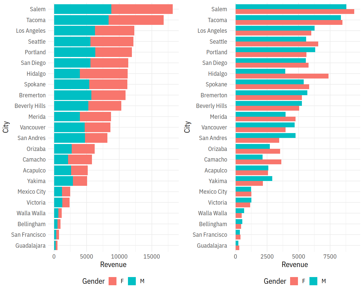
p1 = ggplot(city_gender_rev, aes(City, Revenue, fill = Gender)) +
geom_bar(stat = "identity") +
coord_flip()
p2 = ggplot(city_gender_rev, aes(City, Revenue, fill = Gender)) +
geom_bar(stat = "identity", position = "dodge") +
coord_flip()
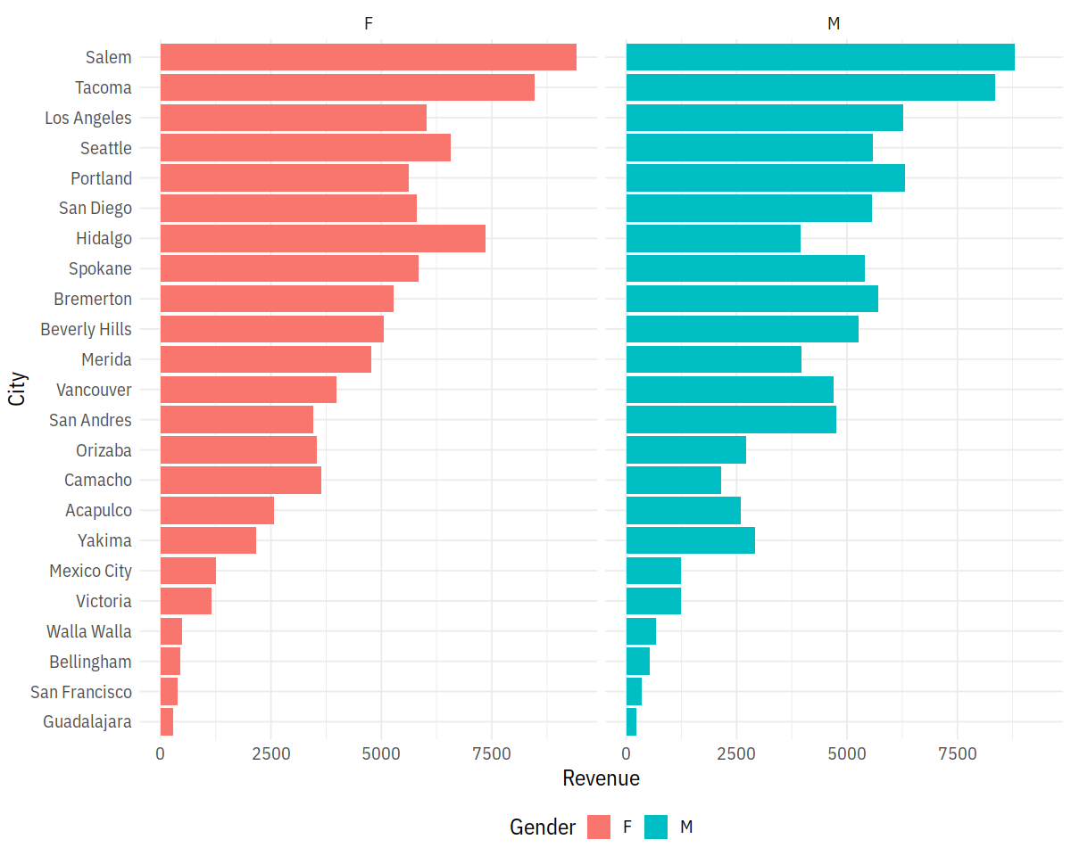
p3 = ggplot(city_gender_rev, aes(City, Revenue, fill = Gender)) +
geom_bar(stat = "identity", position = "dodge") +
coord_flip() +
facet_wrap(~ Gender)
LalRUtils::multiplot(p1, p2, cols=2)
p3
VS building up a Clevland Dot Plot
In [31]:
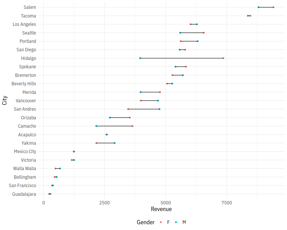
ggplot(city_gender_rev, aes(Revenue, City)) +
        geom_point(aes(color = Gender)) +
        geom_line(aes(group=City))
In [32]:
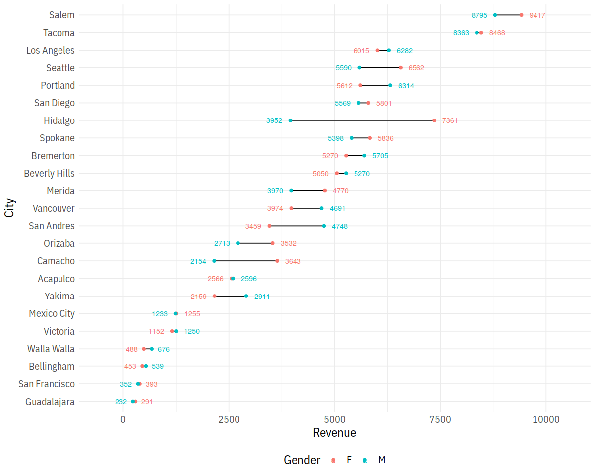
right_label <- city_gender_rev %>%
        group_by(City) %>%
        arrange(desc(Revenue)) %>%
        top_n(1)

left_label <- city_gender_rev %>%
        group_by(City) %>%
        arrange(desc(Revenue)) %>%
        slice(2)

p = ggplot(city_gender_rev, aes(Revenue, City)) +
        geom_line(aes(group = City)) +
        geom_point(aes(color = Gender), size = 1.5) +
        geom_text(data = right_label, aes(color = Gender, label = round(Revenue, 0)),
                  size = 3, hjust = -.5) +
        geom_text(data = left_label, aes(color = Gender, label = round(Revenue, 0)),
                  size = 3, hjust = 1.5) +
        scale_x_continuous(limits = c(-500, 10500))
p
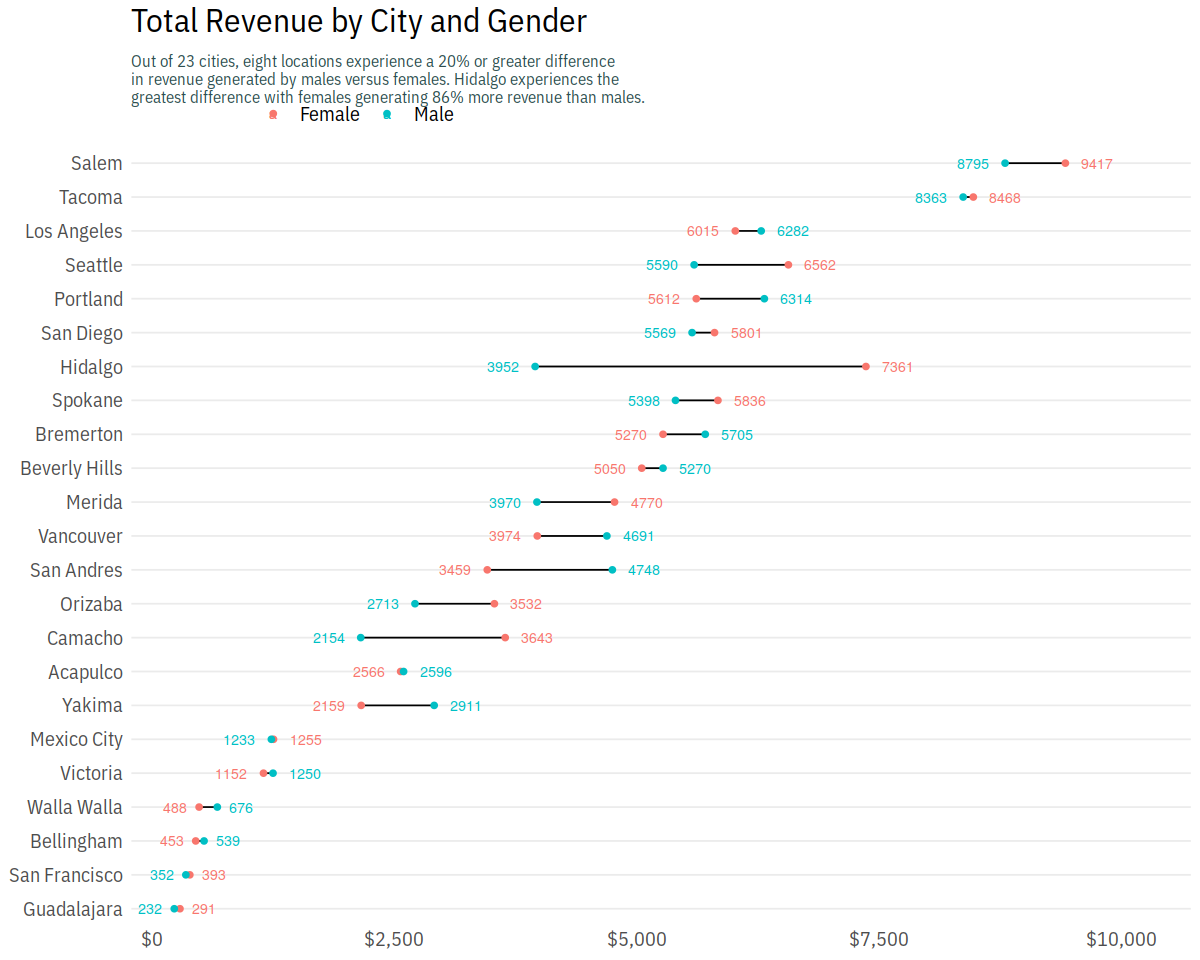
In [35]:
p + scale_color_discrete(labels = c("Female", "Male")) +
        scale_x_continuous(labels = scales::dollar, expand = c(0.02, 0),
                           limits = c(0, 10500),
                           breaks = seq(0, 10000, by = 2500)) +
        scale_y_discrete(expand = c(.02, 0)) +
        labs(title = "Total Revenue by City and Gender",
             subtitle = "Out of 23 cities, eight locations experience a 20% or greater difference \nin revenue generated by males versus females. Hidalgo experiences the \ngreatest difference with females generating 86% more revenue than males.") +
        theme(axis.title = element_blank(),
              panel.grid.major.x = element_blank(),
              panel.grid.minor = element_blank(),
              legend.title = element_blank(),
              legend.justification = c(0, 1),
              legend.position = c(.1, 1.075),
              legend.background = element_blank(),
              legend.direction="horizontal",
              plot.title = element_text(size = 20, margin = margin(b = 10)),
              plot.subtitle = element_text(size = 10, color = "darkslategrey", margin = margin(b = 25)),
              plot.caption = element_text(size = 8, margin = margin(t = 10), color = "grey70", hjust = 0))
Text Plots
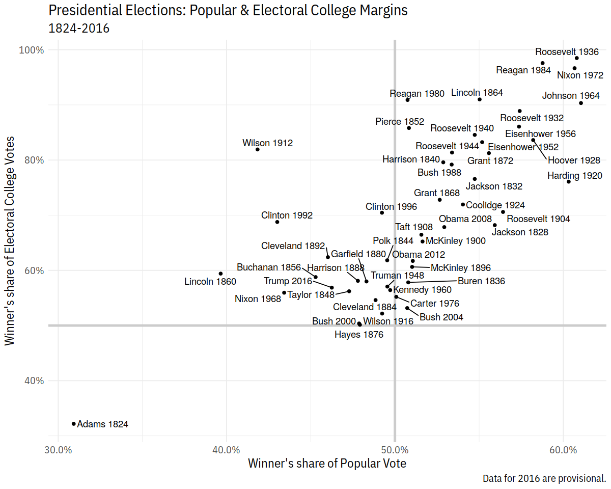
In [36]:
p_title <- "Presidential Elections: Popular & Electoral College Margins"
p_subtitle <- "1824-2016"
p_caption <- "Data for 2016 are provisional."
x_label <- "Winner's share of Popular Vote"
y_label <- "Winner's share of Electoral College Votes"

p <- ggplot(elections_historic, aes(x = popular_pct, y = ec_pct,
                                    label = winner_label))

p + geom_hline(yintercept = 0.5, size = 1.4, color = "gray80") +
    geom_vline(xintercept = 0.5, size = 1.4, color = "gray80") +
    geom_point() +
    geom_text_repel() +
    scale_x_continuous(labels = scales::percent) +
    scale_y_continuous(labels = scales::percent) +
    labs(x = x_label, y = y_label, title = p_title, subtitle = p_subtitle,
         caption = p_caption)
Plotting Models
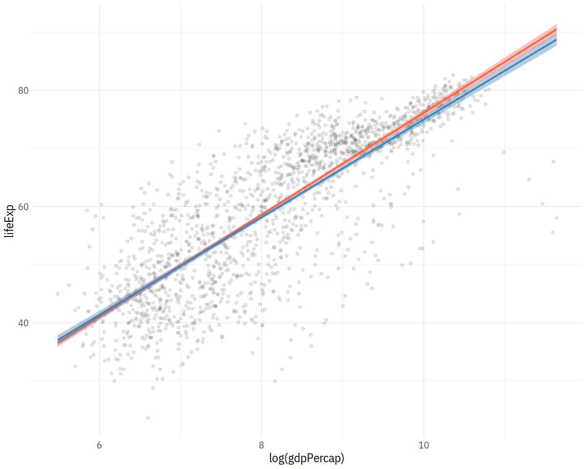
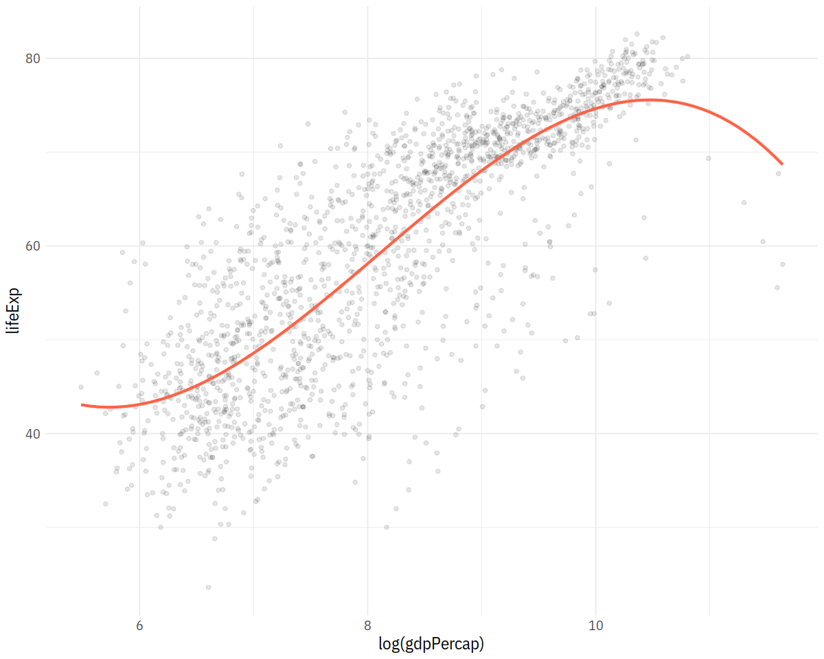
In [37]:
p <- ggplot(data = gapminder,
mapping = aes(x = log(gdpPercap), y = lifeExp))
p + geom_point(alpha=0.1) +
geom_smooth(color = "tomato", fill="tomato", method = MASS::rlm) +
geom_smooth(color = "steelblue", fill="steelblue", method = "lm")
p + geom_point(alpha=0.1) +
geom_smooth(color = "tomato", method = "lm", size = 1.2,
formula = y ~ splines::bs(x, 3), se = FALSE)
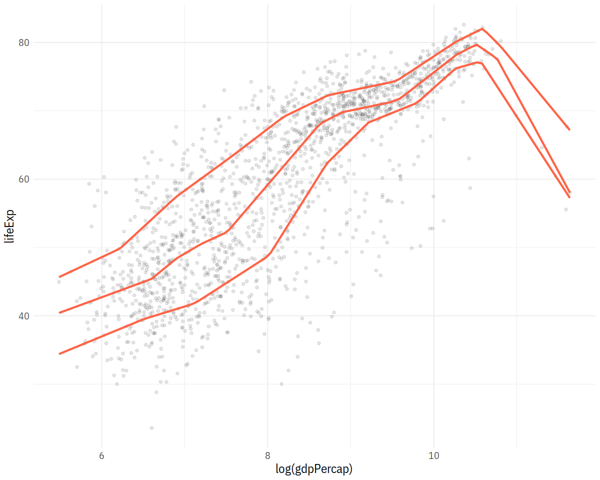
p + geom_point(alpha=0.1) +
geom_quantile(color = "tomato", size = 1.2, method = "rqss",
lambda = 1, quantiles = c(0.20, 0.5, 0.85))
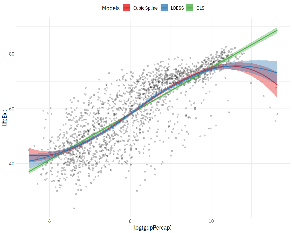
In [38]:
model_colors <- RColorBrewer::brewer.pal(3, "Set1")
p0 <- ggplot(data = gapminder,
            mapping = aes(x = log(gdpPercap), y = lifeExp))

p1 <- p0 + geom_point(alpha = 0.2) +
    geom_smooth(method = "lm", aes(color = "OLS", fill = "OLS")) +
    geom_smooth(method = "lm", formula = y ~ splines::bs(x, df = 3),
                aes(color = "Cubic Spline", fill = "Cubic Spline")) +
    geom_smooth(method = "loess",
                aes(color = "LOESS", fill = "LOESS"))


p1 + scale_color_manual(name = "Models", values = model_colors) +
    scale_fill_manual(name = "Models", values = model_colors) +
    theme(legend.position = "top")
In [39]:
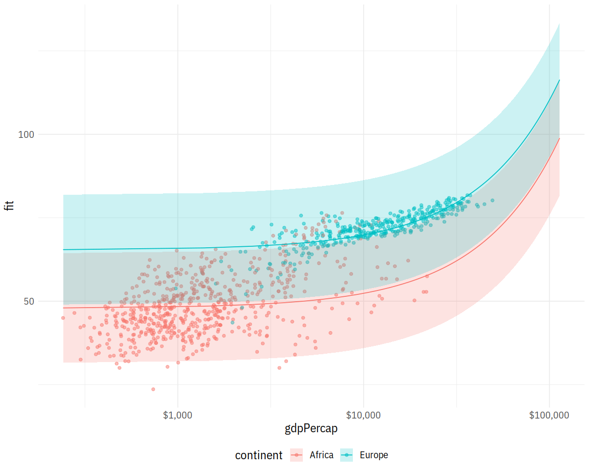
# model
out <- lm(formula = lifeExp ~ gdpPercap + pop + continent,
          data = gapminder)

# new data
min_gdp <- min(gapminder$gdpPercap)
max_gdp <- max(gapminder$gdpPercap)
med_pop <- median(gapminder$pop)

pred_df <- expand.grid(gdpPercap = (seq(from = min_gdp,
                                        to = max_gdp,
                                        length.out = 100)),
                       pop = med_pop,
                       continent = c("Africa", "Americas",
                                     "Asia", "Europe", "Oceania"))

pred_out <- predict(object = out,
                    newdata = pred_df,
                    interval = "predict")

pred_df <- cbind(pred_df, pred_out)
In [40]:
p <- ggplot(data = subset(pred_df, continent %in% c("Europe", "Africa")),
            aes(x = gdpPercap,
                y = fit, ymin = lwr, ymax = upr,
                color = continent,
                fill = continent,
                group = continent))

p + geom_point(data = subset(gapminder,
                             continent %in% c("Europe", "Africa")),
               aes(x = gdpPercap, y = lifeExp,
                   color = continent),
               alpha = 0.5,
               inherit.aes = FALSE) +
    geom_line() +
    geom_ribbon(alpha = 0.2, color = FALSE) +
    scale_x_log10(labels = scales::dollar)
In [41]:
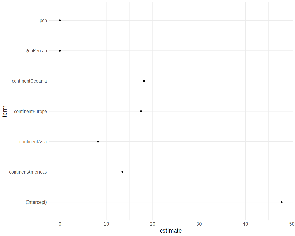
out_comp <- tidy(out)
out_comp %>% round_df()
In [42]:
p <- ggplot(out_comp, mapping = aes(x = term,
                                    y = estimate))

p + geom_point() + coord_flip()
In [43]:
out_conf <- tidy(out, conf.int = TRUE)
out_conf %>% round_df()
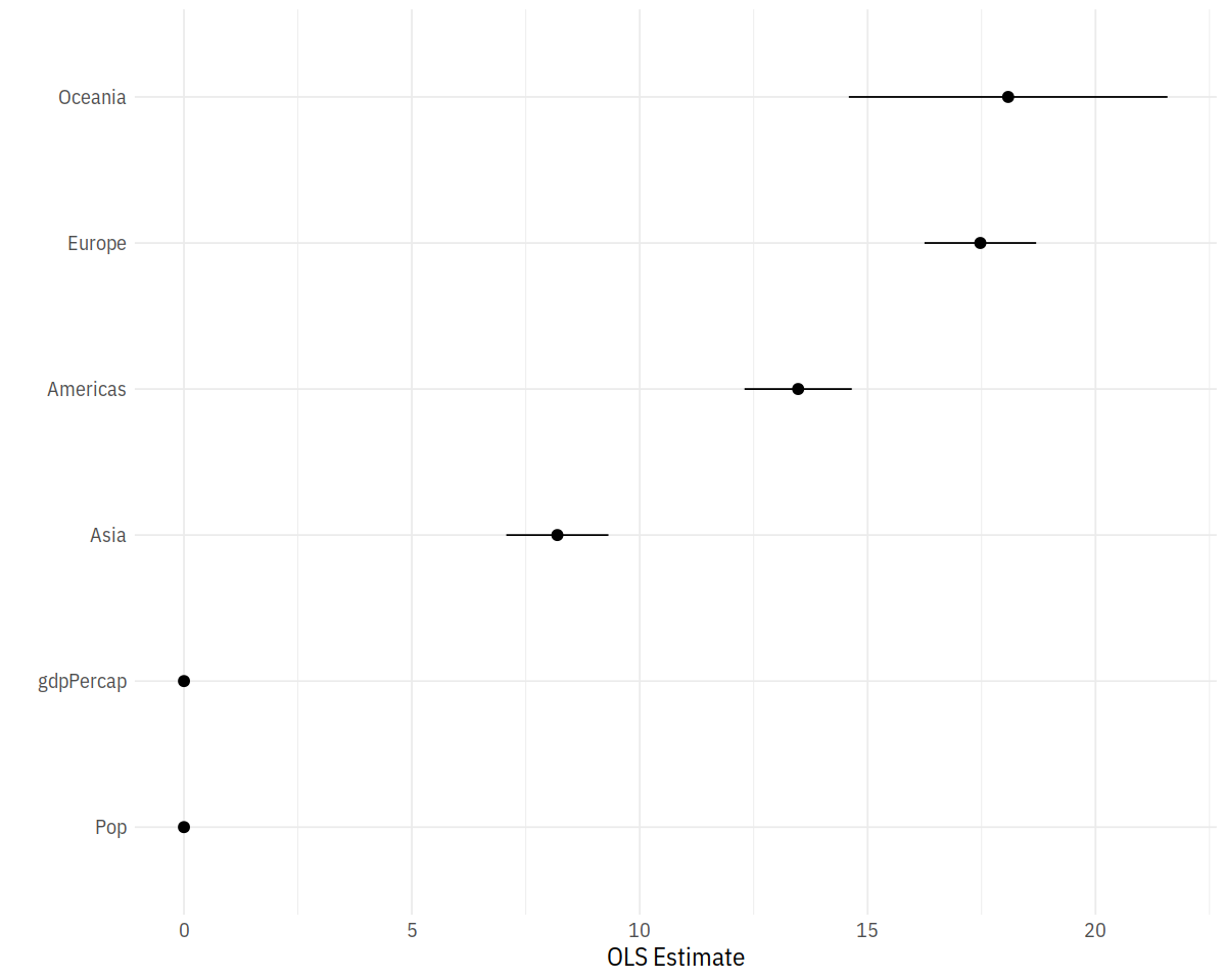
out_conf <- subset(out_conf, term %nin% "(Intercept)")
out_conf$nicelabs <- prefix_strip(out_conf$term, "continent")
p <- ggplot(out_conf, mapping = aes(x = reorder(nicelabs, estimate),
y = estimate, ymin = conf.low, ymax = conf.high))
p + geom_pointrange() + coord_flip() + labs(x='', y="OLS Estimate")
In [44]:
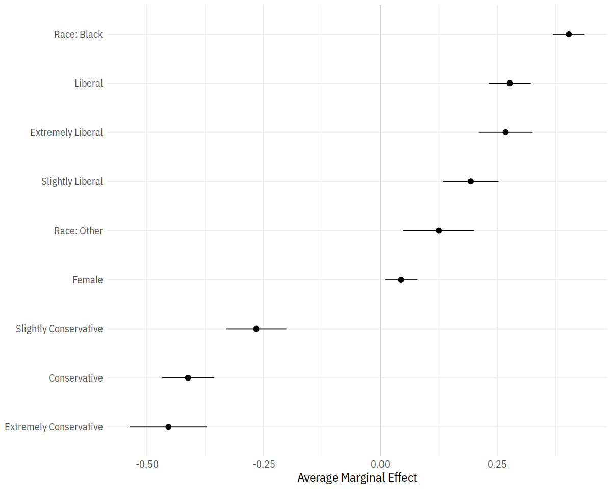
gss_sm$polviews_m <- relevel(gss_sm$polviews, ref = "Moderate")
out_bo <- glm(obama ~ polviews_m + sex*race,
              family = "binomial", data = gss_sm)
bo_m <- margins(out_bo)
summary(bo_m)
In [45]:
bo_gg <- as_tibble(summary(bo_m))
prefixes <- c("polviews_m", "sex")
bo_gg$factor <- prefix_strip(bo_gg$factor, prefixes)
bo_gg$factor <- prefix_replace(bo_gg$factor, "race", "Race: ")

bo_gg %>% select(factor, AME, lower, upper)
p <- ggplot(data = bo_gg, aes(x = reorder(factor, AME),
                              y = AME, ymin = lower, ymax = upper))

p + geom_hline(yintercept = 0, color = "gray80") +
    geom_pointrange() + coord_flip() +
    labs(x = NULL, y = "Average Marginal Effect")
In [46]:
options(survey.lonely.psu = "adjust")
options(na.action="na.pass")

gss_wt <- subset(gss_lon, year > 1974) %>%
    mutate(stratvar = interaction(year, vstrat)) %>%
    as_survey_design(ids = vpsu,
                     strata = stratvar,
                     weights = wtssall,
                     nest = TRUE)

out_mrg <- gss_wt %>%
    filter(year %in% seq(1976, 2016, by = 4)) %>%
    mutate(racedeg = interaction(race, degree)) %>%
    group_by(year, racedeg) %>%
    summarize(prop = survey_mean(na.rm = TRUE)) %>%
    separate(racedeg, sep = "\\.", into = c("race", "degree"))
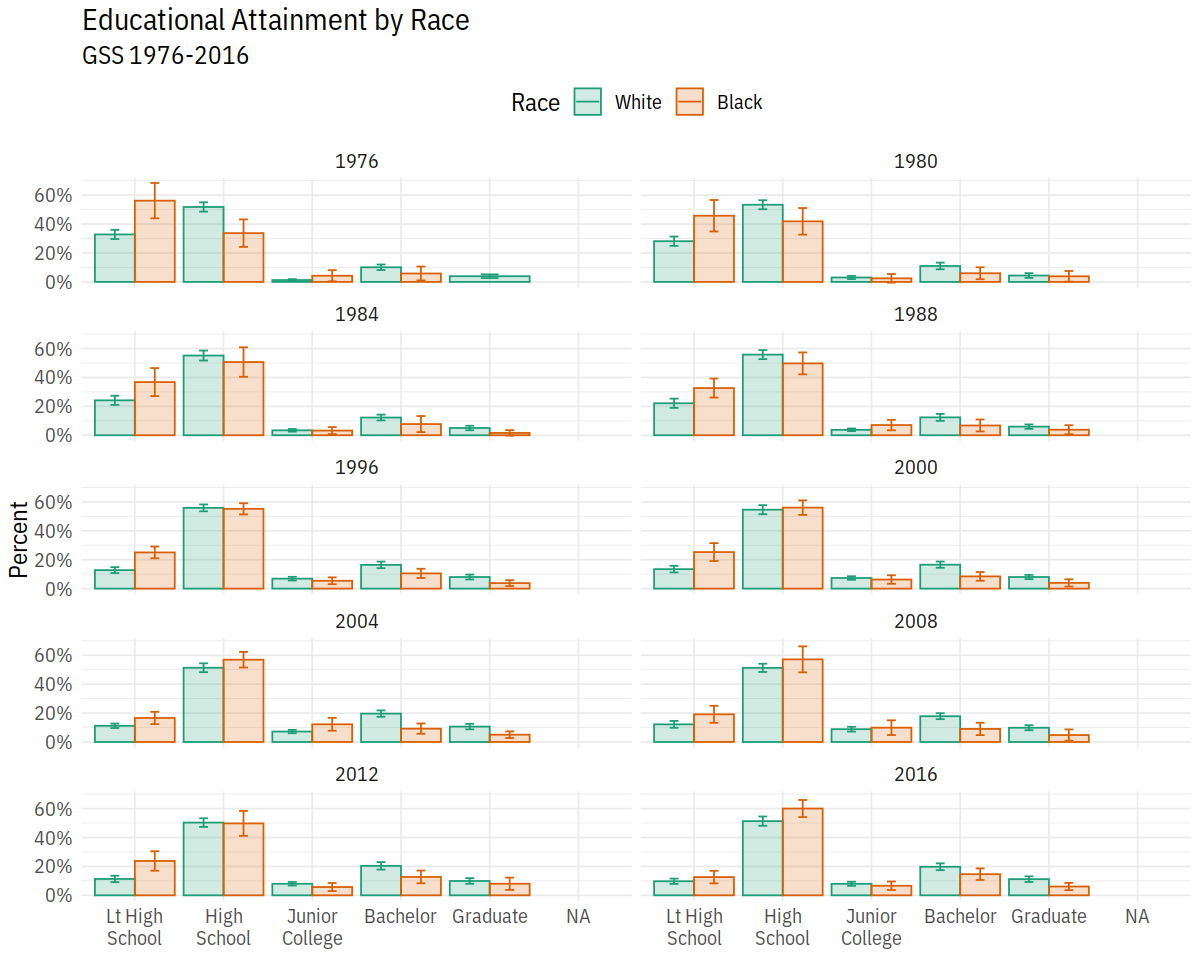
In [47]:
out_grp <- gss_wt %>%
    filter(year %in% seq(1976, 2016, by = 4)) %>%
    group_by(year, race, degree) %>%
    summarize(prop = survey_mean(na.rm = TRUE))
In [48]:
p <- ggplot(data = subset(out_grp, race %nin% "Other"),
            mapping = aes(x = degree, y = prop,
                          ymin = prop - 2*prop_se,
                          ymax = prop + 2*prop_se,
                          fill = race,
                          color = race,
                          group = race))

dodge <- position_dodge(width=0.9)

p + geom_col(position = dodge, alpha = 0.2) +
    geom_errorbar(position = dodge, width = 0.2) +
    scale_x_discrete(labels = scales::wrap_format(10)) +
    scale_y_continuous(labels = scales::percent) +
    scale_color_brewer(type = "qual", palette = "Dark2") +
    scale_fill_brewer(type = "qual", palette = "Dark2") +
    labs(title = "Educational Attainment by Race",
         subtitle = "GSS 1976-2016",
         fill = "Race",
         color = "Race",
         x = NULL, y = "Percent") +
    facet_wrap(~ year, ncol = 2) +
    theme(legend.position = "top")
In [49]:
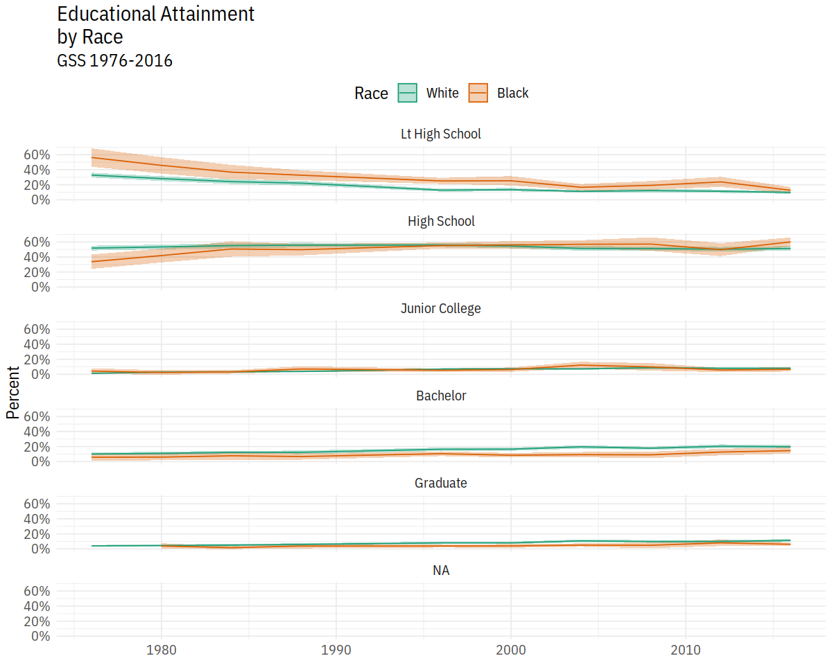
p <- ggplot(data = subset(out_grp, race %nin% "Other"),
            mapping = aes(x = year, y = prop, ymin = prop - 2*prop_se,
                          ymax = prop + 2*prop_se, fill = race, color = race,
                          group = race))

p + geom_ribbon(alpha = 0.3, aes(color = NULL)) +
    geom_line() +
    facet_wrap(~ degree, ncol = 1) +
    scale_y_continuous(labels = scales::percent) +
    scale_color_brewer(type = "qual", palette = "Dark2") +
    scale_fill_brewer(type = "qual", palette = "Dark2") +
    labs(title = "Educational Attainment\nby Race",
         subtitle = "GSS 1976-2016", fill = "Race",
         color = "Race", x = NULL, y = "Percent") +
    theme(legend.position = "top")
Spatial
In [50]:
party_colors <- c("#2E74C0", "#CB454A")
p0 <- ggplot(data = subset(election, st %nin% "DC"),
mapping = aes(x = r_points,
y = reorder(state, r_points),
color = party))
p1 <- p0 + geom_vline(xintercept = 0, color = "gray30") +
geom_point(size = 2)
p2 <- p1 + scale_color_manual(values = party_colors)
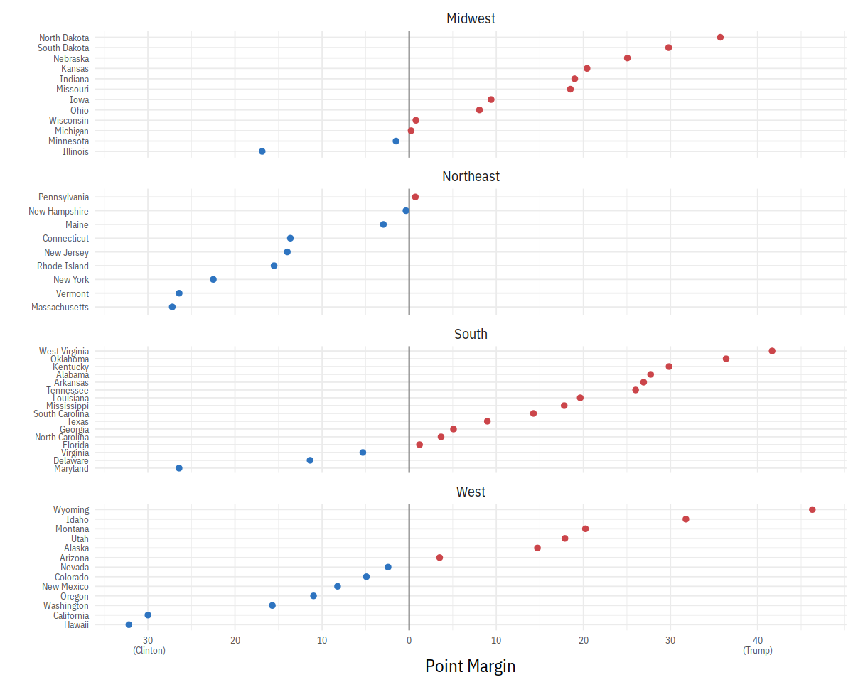
p3 <- p2 + scale_x_continuous(breaks = c(-30, -20, -10, 0, 10, 20, 30, 40),
labels = c("30\n (Clinton)", "20", "10", "0",
"10", "20", "30", "40\n(Trump)"))
p3 + facet_wrap(~ census, ncol=1, scales="free_y") +
guides(color=FALSE) + labs(x = "Point Margin", y = "") +
theme(axis.text=element_text(size=8))
In [51]:
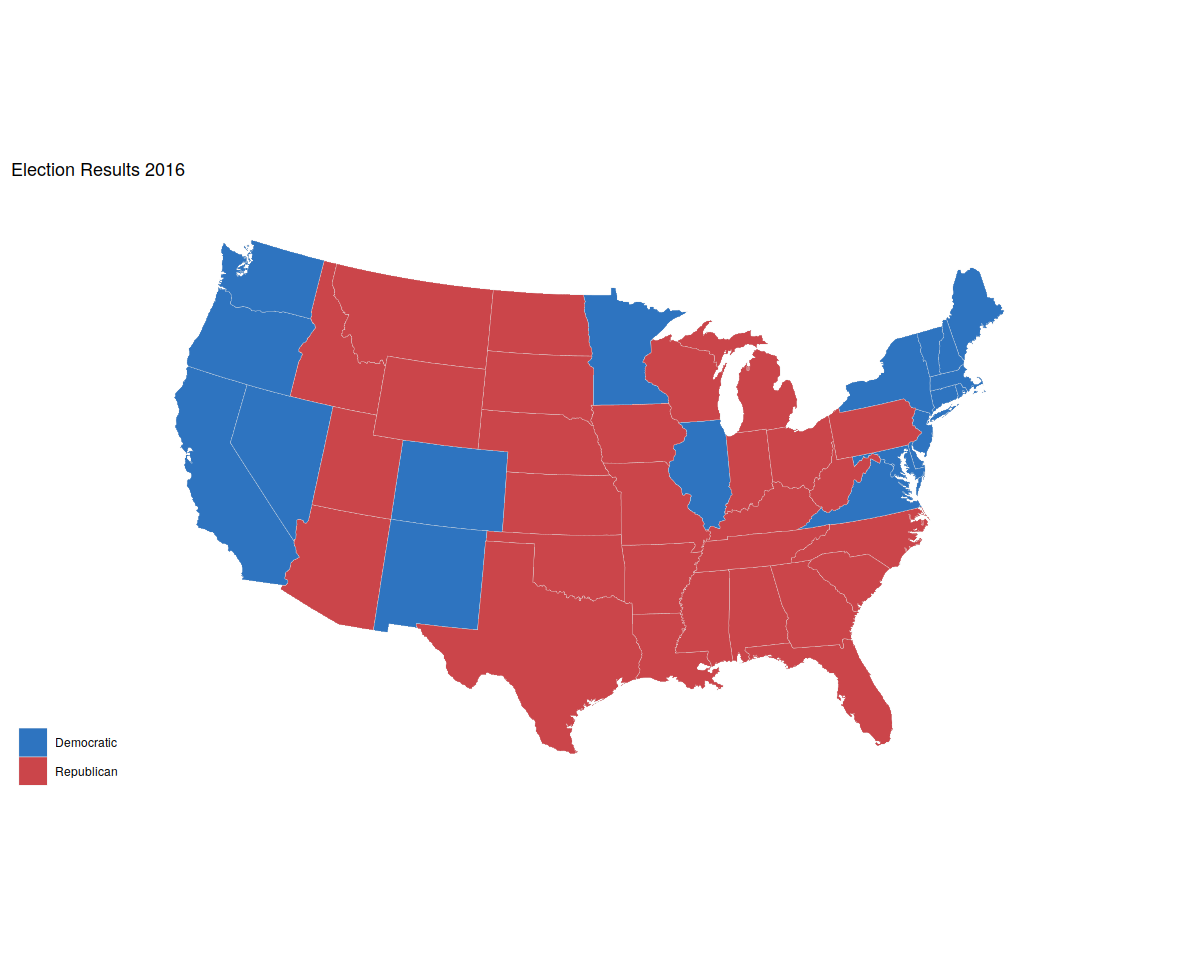
us_states <- map_data("state")

election$region <- tolower(election$state)
us_states_elec <- left_join(us_states, election)
In [52]:
p0 <- ggplot(data = us_states_elec,
             mapping = aes(x = long, y = lat,
                           group = group, fill = party))
p1 <- p0 + geom_polygon(color = "gray90", size = 0.1) +
    coord_map(projection = "albers", lat0 = 39, lat1 = 45)
p2 <- p1 + scale_fill_manual(values = party_colors) +
    labs(title = "Election Results 2016", fill = NULL)
p2 + theme_map()
In [53]:
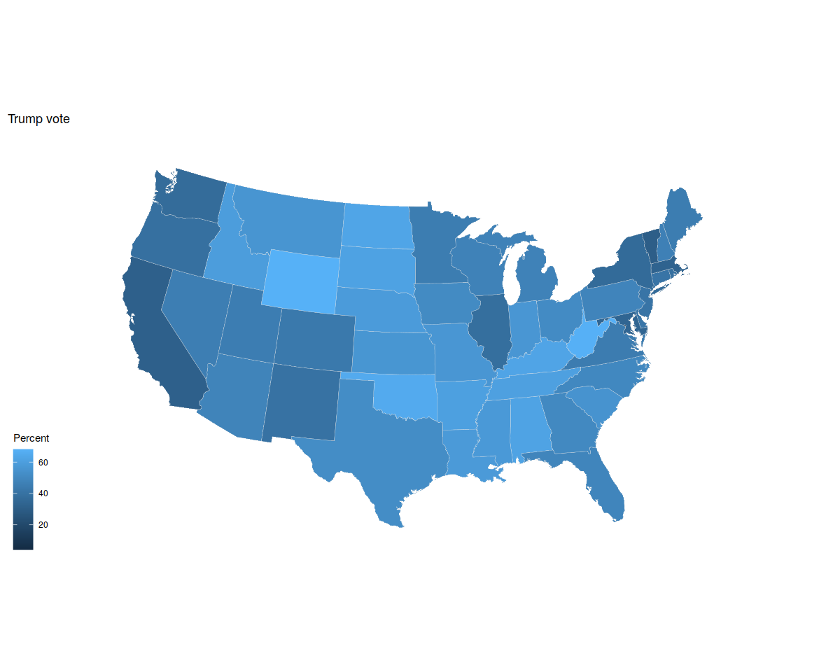
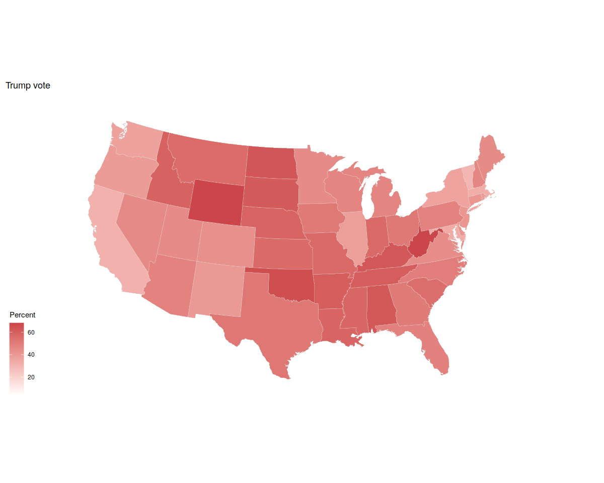
p0 <- ggplot(data = us_states_elec,
             mapping = aes(x = long, y = lat, group = group, fill = pct_trump))

p1 <- p0 + geom_polygon(color = "gray90", size = 0.1) +
    coord_map(projection = "albers", lat0 = 39, lat1 = 45)

p1 + labs(title = "Trump vote") + theme_map() + labs(fill = "Percent")

p2 <- p1 + scale_fill_gradient(low = "white", high = "#CB454A") +
        labs(title = "Trump vote")
p2 + theme_map() + labs(fill = "Percent")
In [54]:
p0 <- ggplot(data = us_states_elec,
mapping = aes(x = long, y = lat, group = group, fill = d_points))
p1 <- p0 + geom_polygon(color = "gray90", size = 0.1) +
coord_map(projection = "albers", lat0 = 39, lat1 = 45)
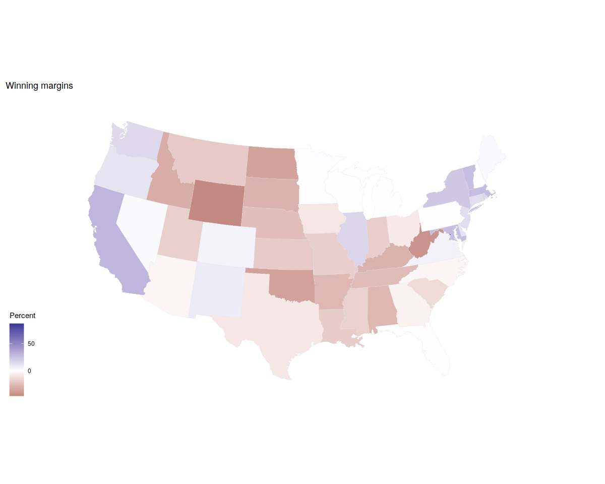
p2 <- p1 + scale_fill_gradient2() + labs(title = "Winning margins")
p2 + theme_map() + labs(fill = "Percent")
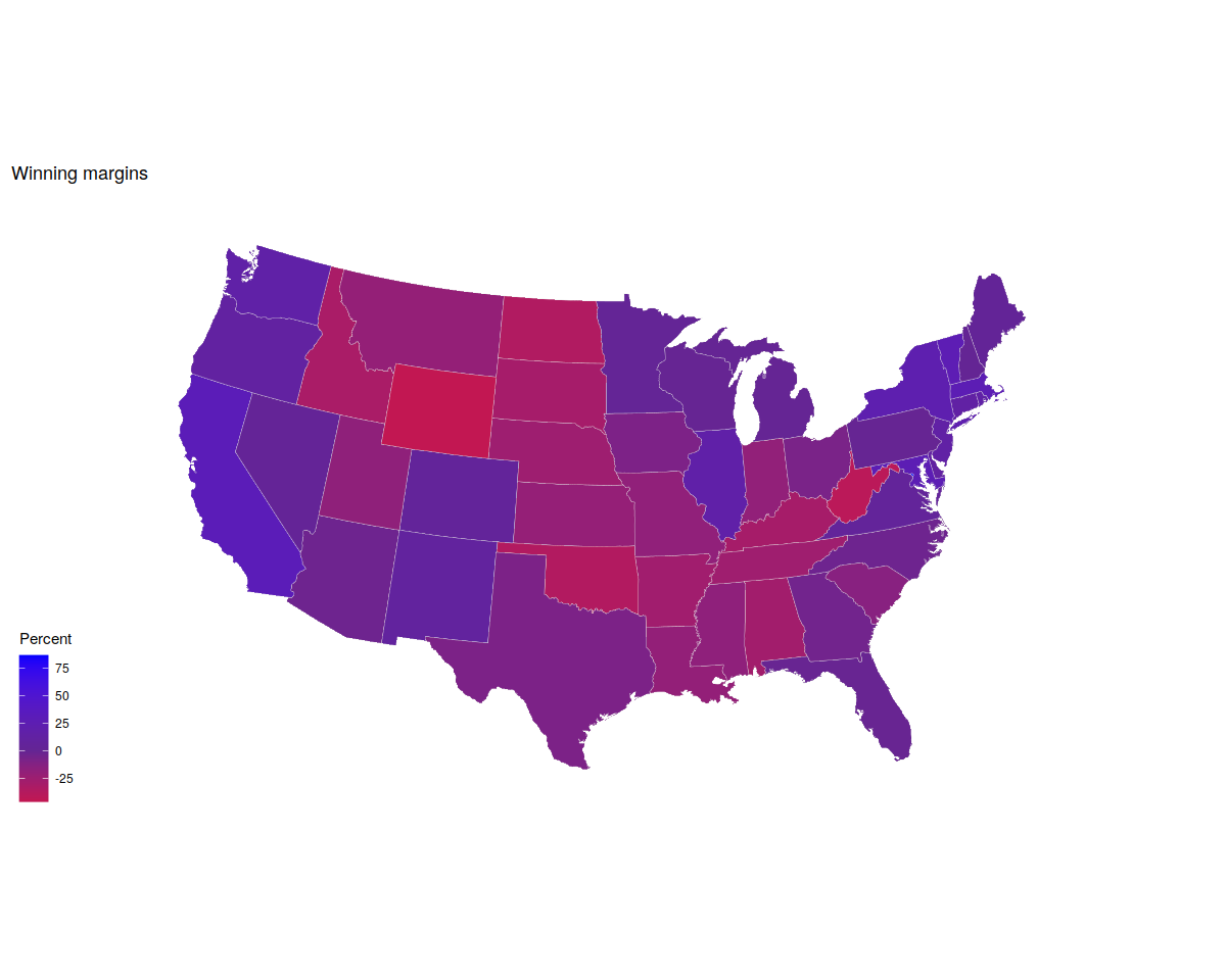
p3 <- p1 + scale_fill_gradient2(low = "red", mid = scales::muted("purple"),
high = "blue", breaks = c(-25, 0, 25, 50, 75)) +
labs(title = "Winning margins")
p3 + theme_map() + labs(fill = "Percent")
In [55]:
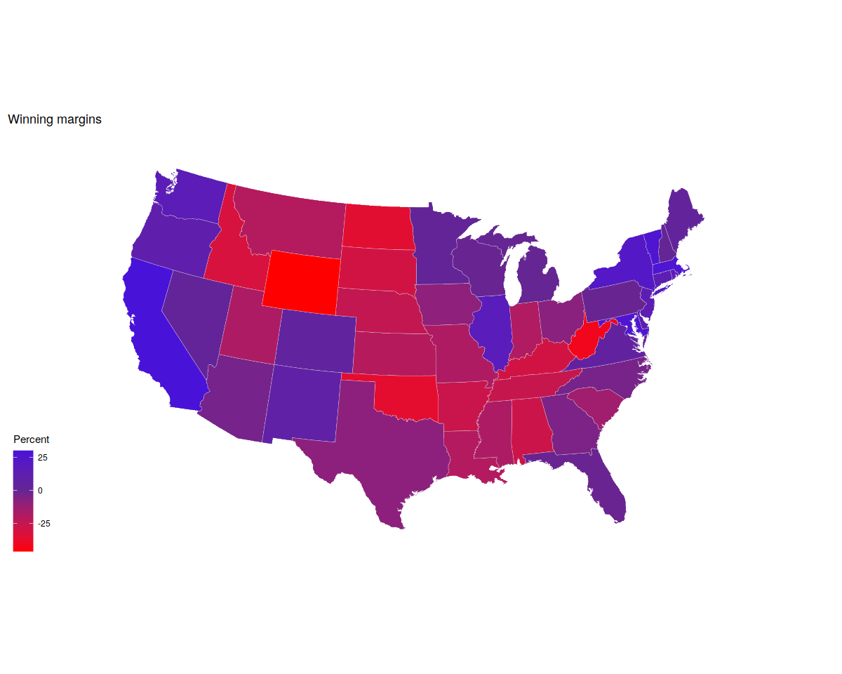
p0 <- ggplot(data = subset(us_states_elec,
                           region %nin% "district of columbia"),
             aes(x = long, y = lat, group = group, fill = d_points))

p1 <- p0 + geom_polygon(color = "gray90", size = 0.1) +
    coord_map(projection = "albers", lat0 = 39, lat1 = 45)

p2 <- p1 + scale_fill_gradient2(low = "red",
                                mid = scales::muted("purple"),
                                high = "blue") +
    labs(title = "Winning margins")
p2 + theme_map() + labs(fill = "Percent")
In [56]:
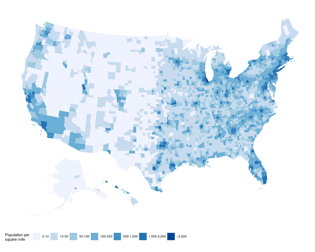
county_full <- left_join(county_map, county_data, by = "id")
In [57]:
p <- ggplot(data = county_full,
            mapping = aes(x = long, y = lat,
                          fill = pop_dens,
                          group = group))

p1 <- p + geom_polygon(color = "gray90", size = 0.05) + coord_equal()

p2 <- p1 + scale_fill_brewer(palette="Blues",
                             labels = c("0-10", "10-50", "50-100", "100-500",
                                        "500-1,000", "1,000-5,000", ">5,000"))

p2 + labs(fill = "Population per\nsquare mile") +
    theme_map() +
    guides(fill = guide_legend(nrow = 1)) +
    theme(legend.position = "bottom")
Refining / Customising
In [58]:
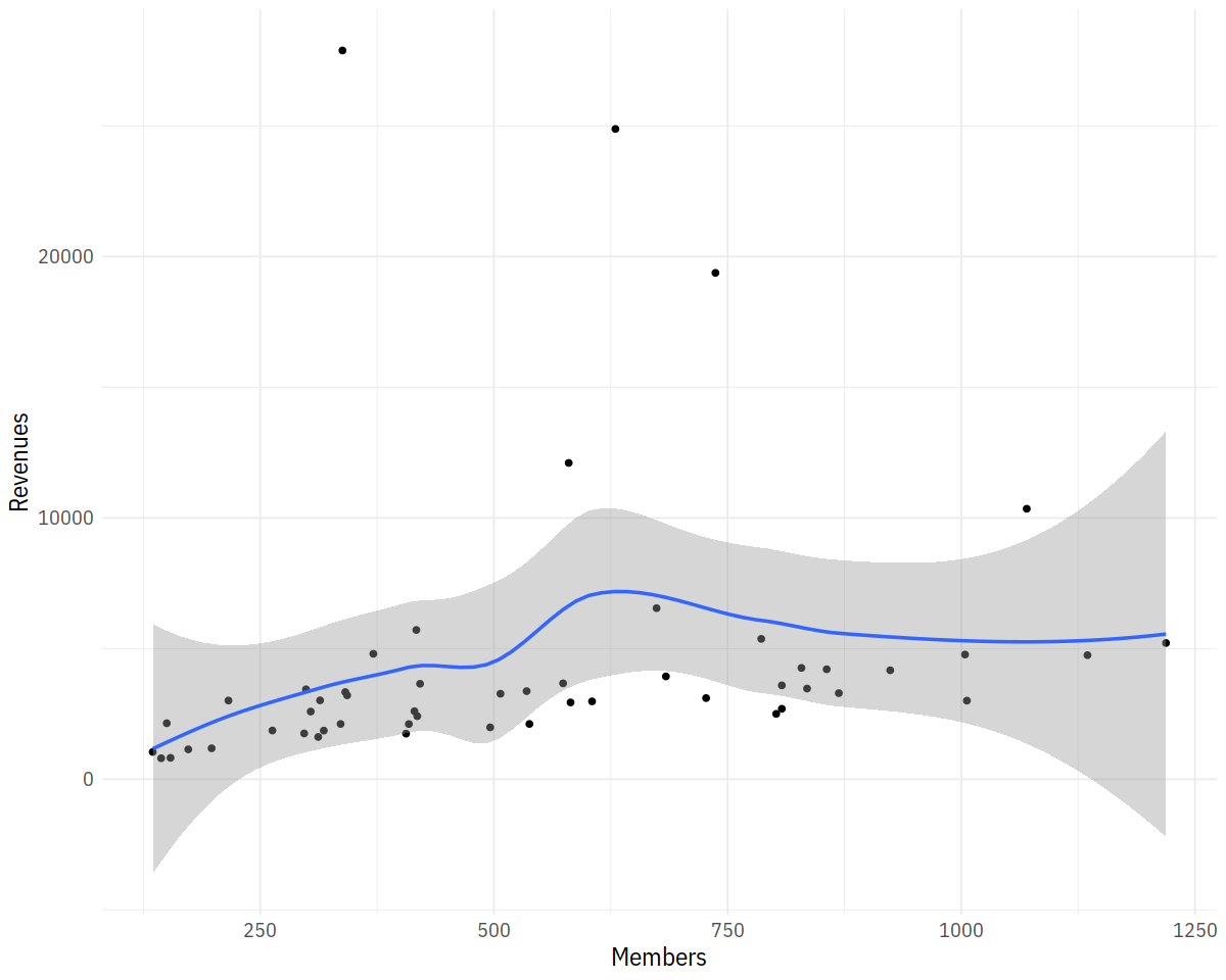
p <- ggplot(data = subset(asasec, Year == 2014),
            mapping = aes(x = Members, y = Revenues, label = Sname))

p + geom_point() + geom_smooth()
In [59]:
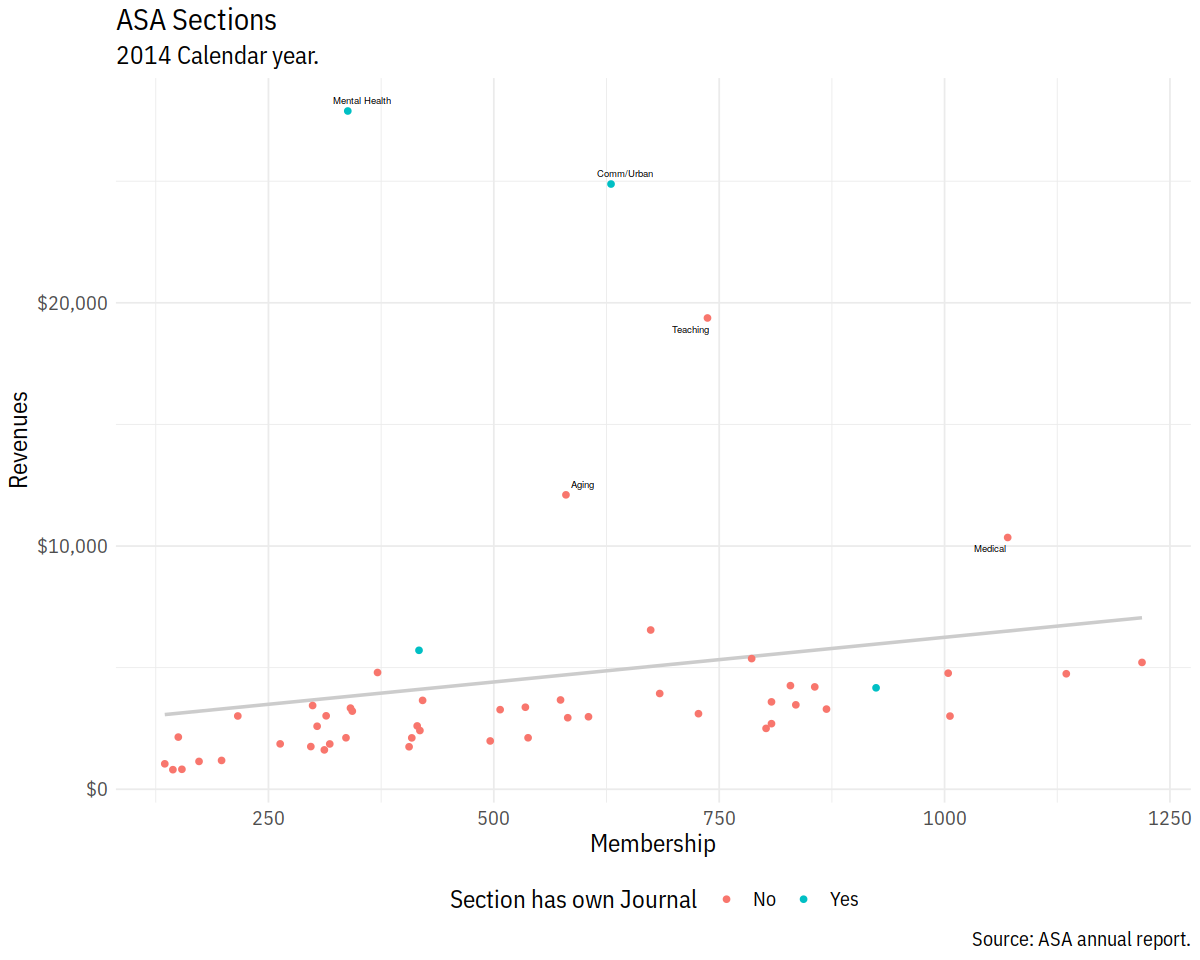
p0 <- ggplot(data = subset(asasec, Year == 2014),
             mapping = aes(x = Members, y = Revenues, label = Sname))

p1 <- p0 + geom_smooth(method = "lm", se = FALSE, color = "gray80") +
    geom_point(mapping = aes(color = Journal))

p2 <- p1 + geom_text_repel(data=subset(asasec,
                                       Year == 2014 & Revenues > 7000),
                           size = 2)
In [60]:
p3 <- p2 + labs(x="Membership",
        y="Revenues",
        color = "Section has own Journal",
        title = "ASA Sections",
        subtitle = "2014 Calendar year.",
        caption = "Source: ASA annual report.")
p4 <- p3 + scale_y_continuous(labels = scales::dollar) +
     theme(legend.position = "bottom")
p4
In [61]:
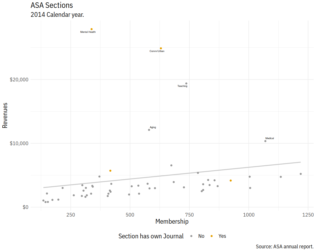
cb_palette <- c("#999999", "#E69F00", "#56B4E9", "#009E73",
                "#F0E442", "#0072B2", "#D55E00", "#CC79A7")

p4 + scale_color_manual(values = cb_palette)
In [62]:
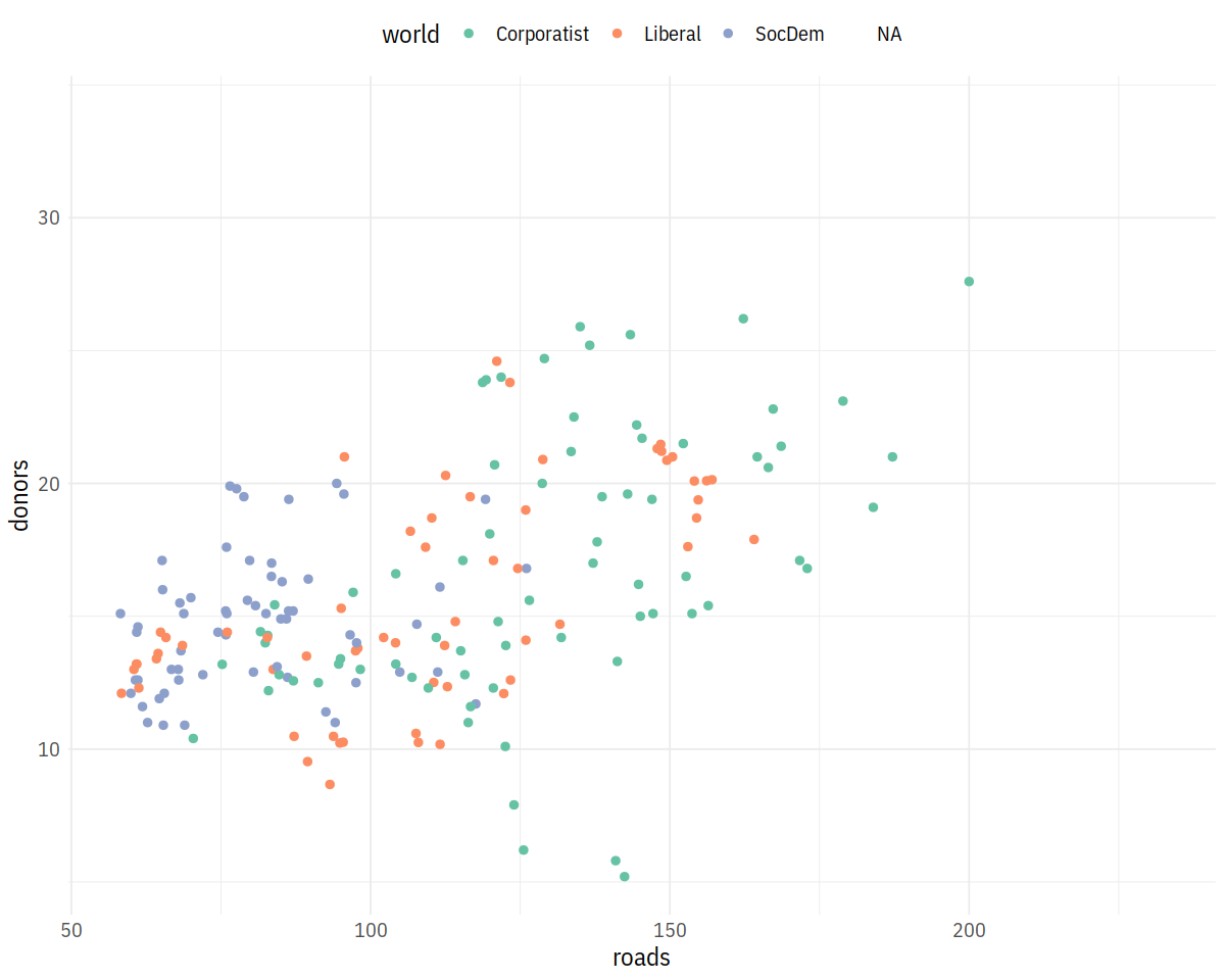
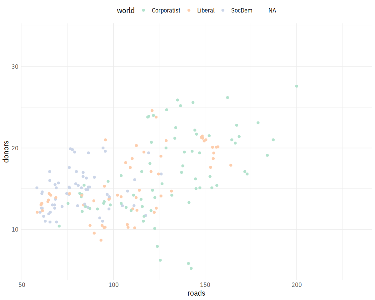
p <- ggplot(data = organdata,
            mapping = aes(x = roads, y = donors, color = world))
p + geom_point(size = 2) + scale_color_brewer(palette = "Set2") +
    theme(legend.position = "top")
In [63]:
p + geom_point(size = 2) + scale_color_brewer(palette = "Pastel2") +
        theme(legend.position = "top")
In [64]:
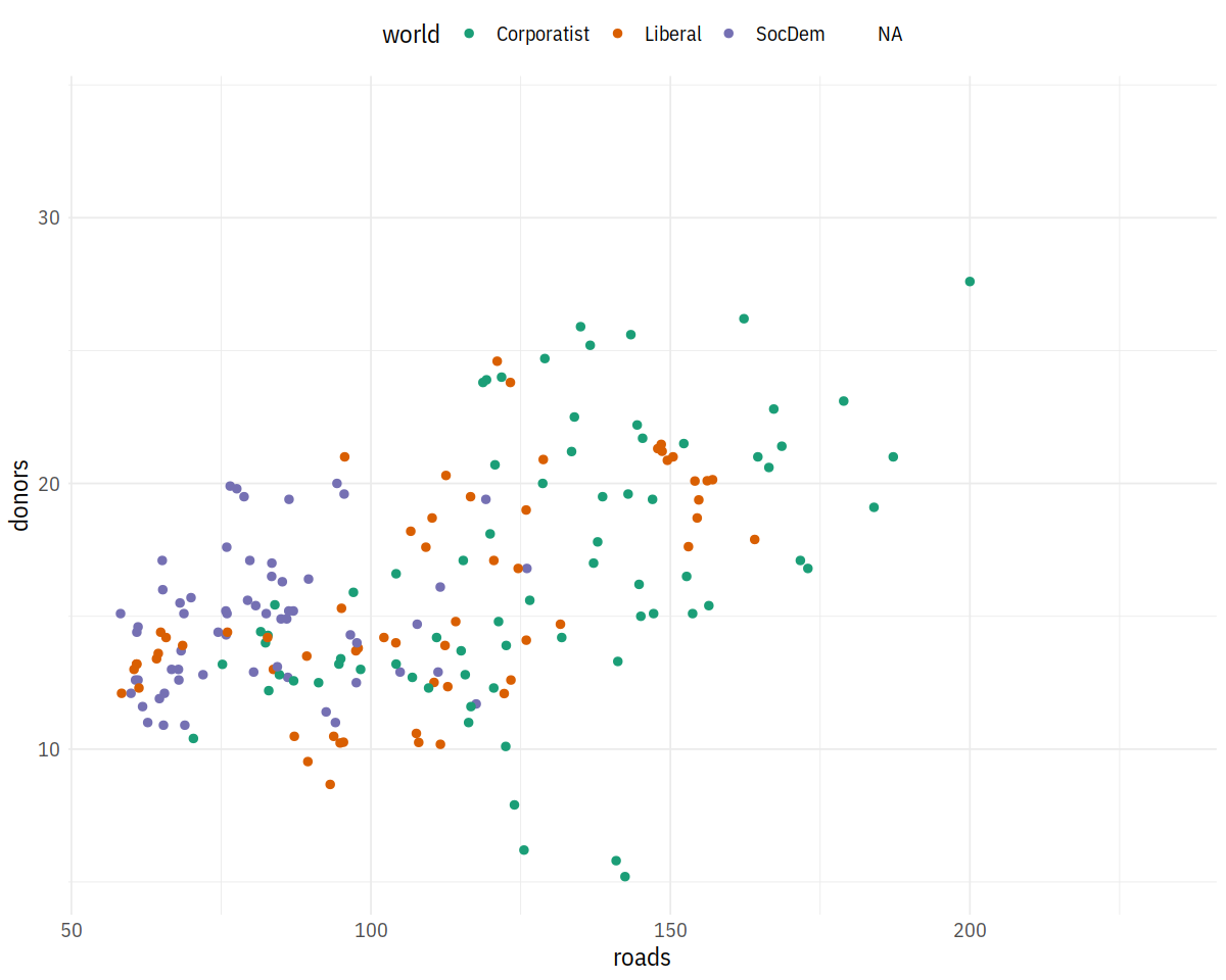
p + geom_point(size = 2) + scale_color_brewer(palette = "Dark2") +
    theme(legend.position='top')
In [65]:
party_colors <- c("#2E74C0", "#CB454A")
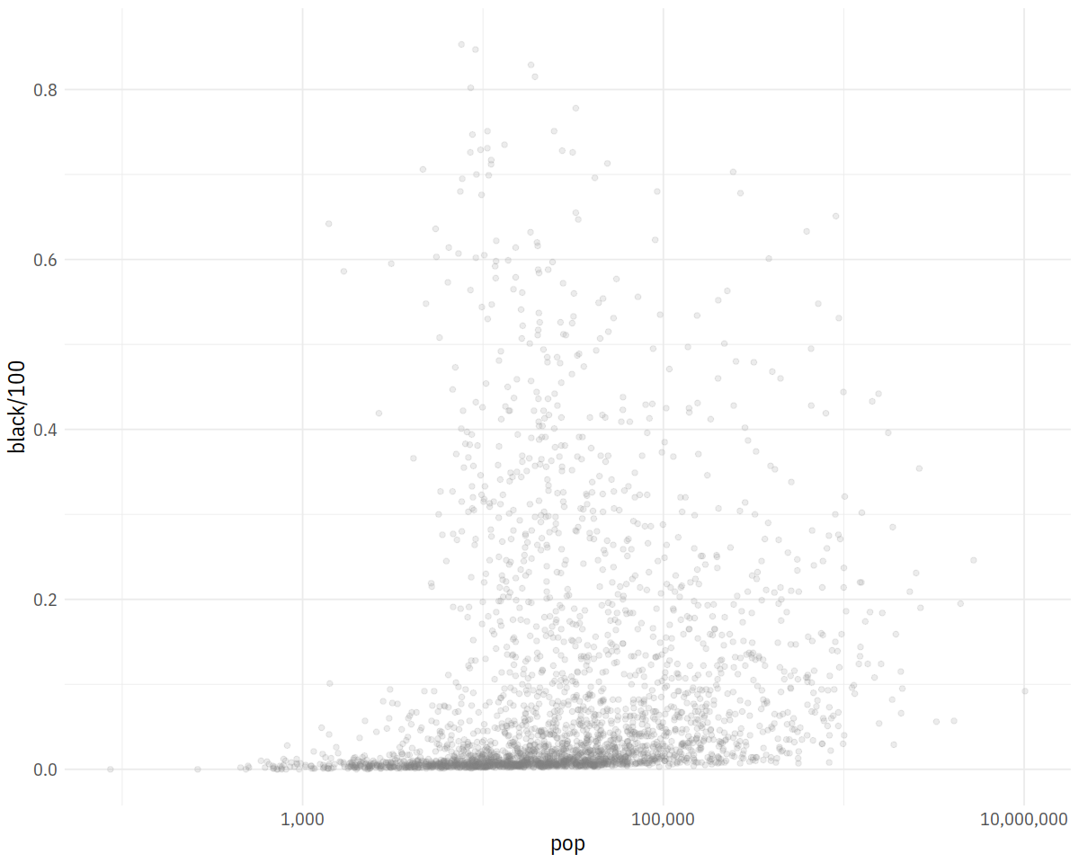
p0 <- ggplot(data = subset(county_data,
flipped == "No"),
mapping = aes(x = pop,
y = black/100))
p1 <- p0 + geom_point(alpha = 0.15, color = "gray50") +
scale_x_log10(labels=scales::comma)
p1
In [66]:
p2 <- p1 + geom_point(data = subset(county_data,
                                    flipped == "Yes"),
                      mapping = aes(x = pop, y = black/100,
                                    color = partywinner16)) +
    scale_color_manual(values = party_colors)

p2
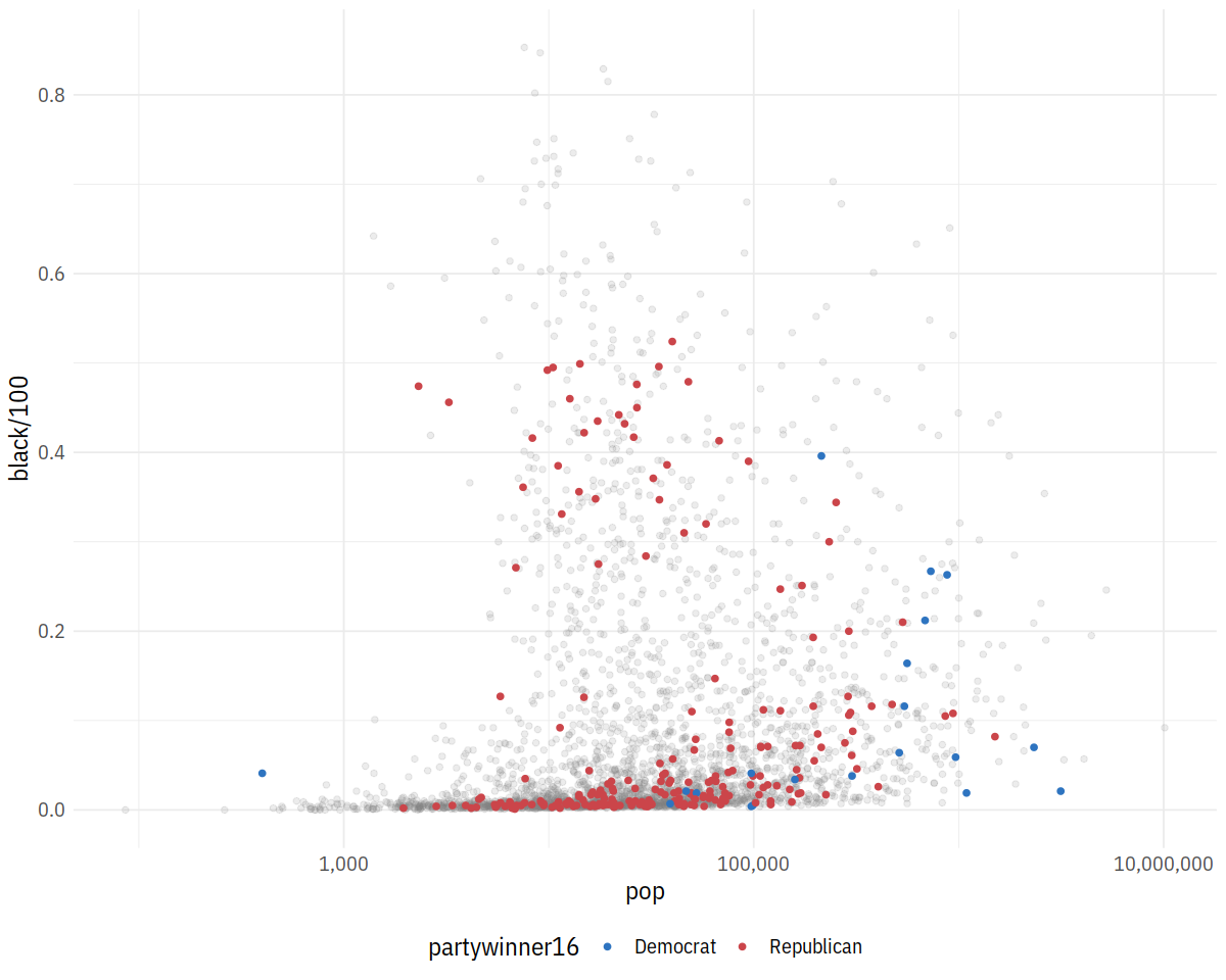
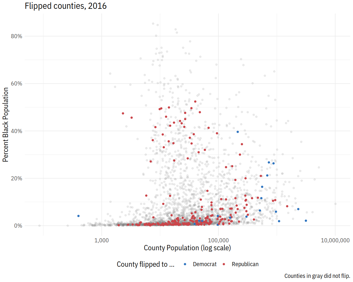
In [67]:
p3 <- p2 + scale_y_continuous(labels=scales::percent) +
    labs(color = "County flipped to ... ",
         x = "County Population (log scale)",
         y = "Percent Black Population",
         title = "Flipped counties, 2016",
         caption = "Counties in gray did not flip.")

p3
In [68]:
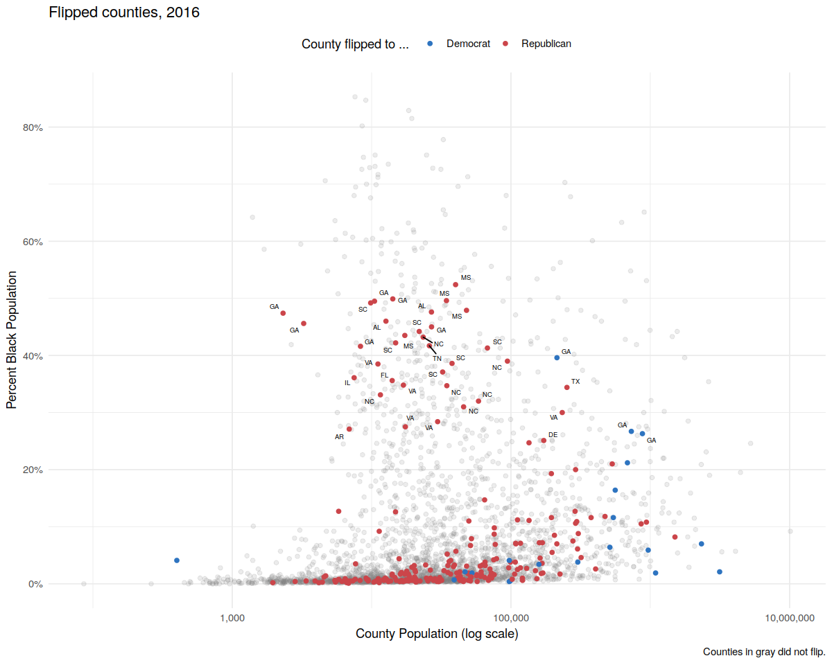
p4 <- p3 + geom_text_repel(data = subset(county_data,
                                      flipped == "Yes" &
                                      black  > 25),
                           mapping = aes(x = pop,
                                   y = black/100,
                                   label = state), size = 2)

p4 + theme_minimal() +
    theme(legend.position="top")
In [69]:
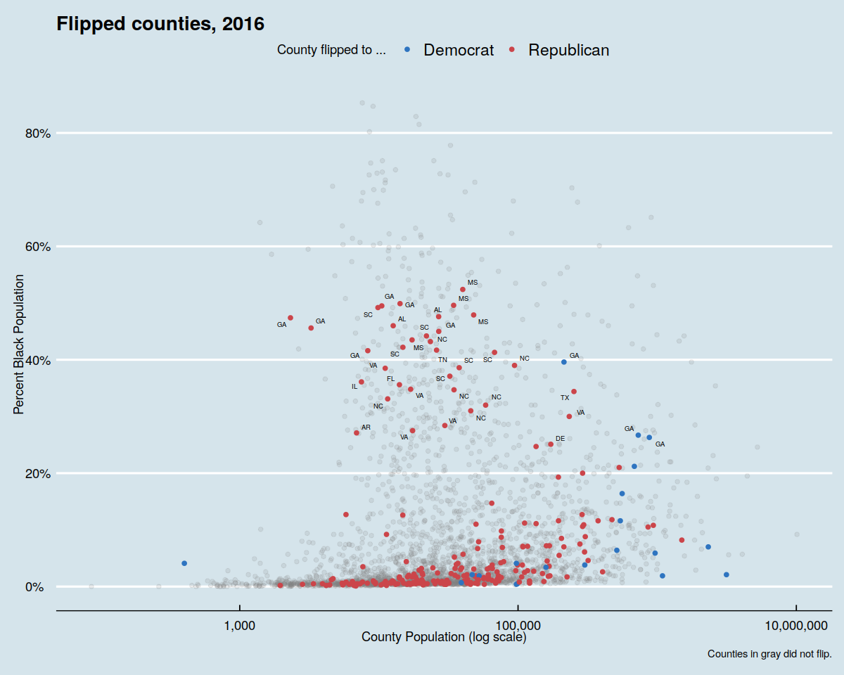
theme_set(theme_economist())
p4 + theme(legend.position="top")
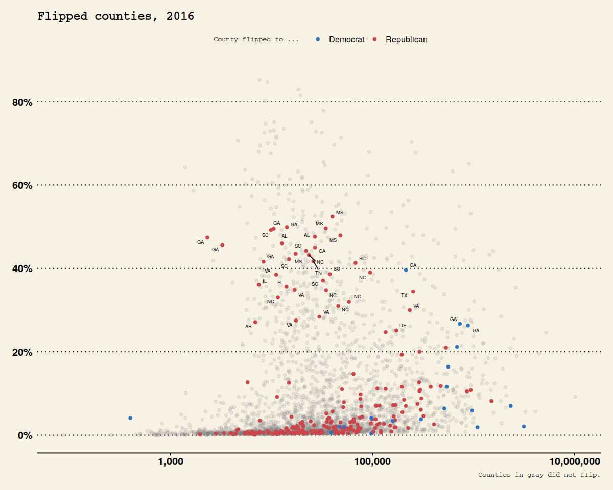
theme_set(theme_wsj())
p4 + theme(plot.title = element_text(size = rel(0.6)),
legend.title = element_text(size = rel(0.35)),
plot.caption = element_text(size = rel(0.35)),
legend.position = "top")
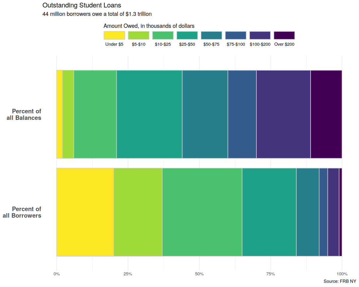
Alternatives to Pie Charts
In [70]:
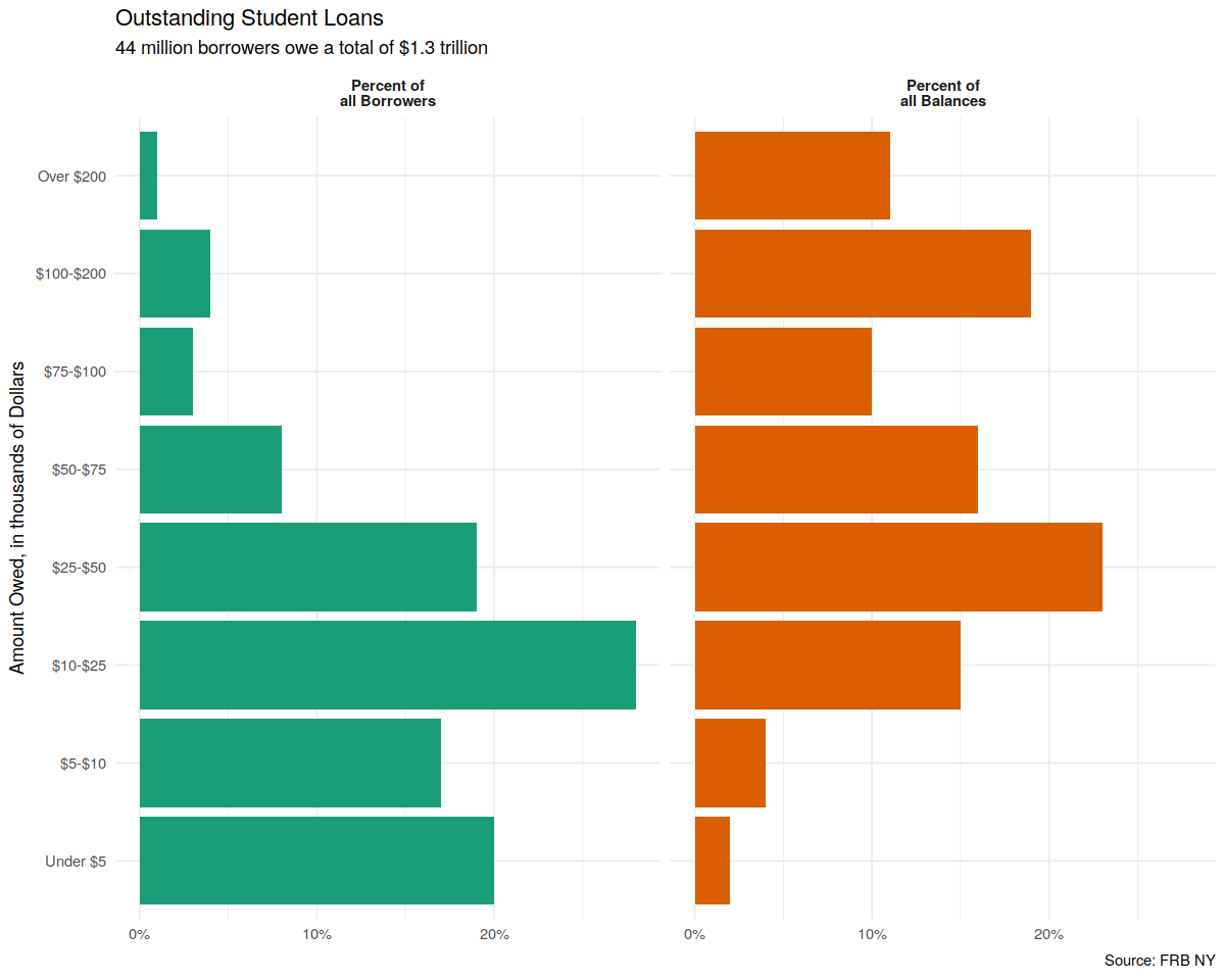
theme_set(theme_minimal())
p_xlab <- "Amount Owed, in thousands of Dollars"
p_title <- "Outstanding Student Loans"
p_subtitle <- "44 million borrowers owe a total of $1.3 trillion"
p_caption <- "Source: FRB NY"

f_labs <- c(`Borrowers` = "Percent of\nall Borrowers",
            `Balances` = "Percent of\nall Balances")

p <- ggplot(data = studebt,
            mapping = aes(x = Debt, y = pct/100, fill = type))
p + geom_bar(stat = "identity") +
    scale_fill_brewer(type = "qual", palette = "Dark2") +
    scale_y_continuous(labels = scales::percent) +
    guides(fill = FALSE) +
    theme(strip.text.x = element_text(face = "bold")) +
    labs(y = NULL, x = p_xlab,
      caption = p_caption,
      title = p_title,
      subtitle = p_subtitle) +
    facet_grid(~ type, labeller = as_labeller(f_labs)) +
    coord_flip()
In [71]:
p <- ggplot(studebt, aes(y = pct/100, x = type, fill = Debtrc))
p + geom_bar(stat = "identity", color = "gray80") +
  scale_x_discrete(labels = as_labeller(f_labs)) +
  scale_y_continuous(labels = scales::percent) +
  scale_fill_viridis(discrete = TRUE) +
  guides(fill = guide_legend(reverse = TRUE,
                             title.position = "top",
                             label.position = "bottom",
                             keywidth = 3,
                             nrow = 1)) +
  labs(x = NULL, y = NULL,
       fill = "Amount Owed, in thousands of dollars",
       caption = p_caption,
       title = p_title,
       subtitle = p_subtitle) +
  theme(legend.position = "top",
        axis.text.y = element_text(face = "bold", hjust = 1, size = 12),
        axis.ticks.length = unit(0, "cm"),
        panel.grid.major.y = element_blank()) +
  coord_flip()